Power BI
By interpreting raw data into visual representations such as images, diagrams, videos, graphs, and more, Power Bi Custom Visualization allows you to gain insights from your data. Business owners, users, or analytics teams can access this custom visual capability by Microsoft to evaluate data and create interactive rich reports for better decision-making.
Developers use the bespoke visuals software development kit (SDK) to create individualized graphics. The visualizations are created using JavaScript libraries like JQuery and R scripts. Additionally, developers spend time testing and fixing bugs. If you package your open-source data visualization in a.pbiviz file, you can submit it to Microsoft’s AppSource and have it count as a non-proprietary data visualization. The individualized visualizations can be downloaded in Power BI format or incorporated into existing reports.
This article was published as a part of the Data Science Blogathon.
These visuals fall into one of three buckets, depending on their deployment, as shown in Figure 1.
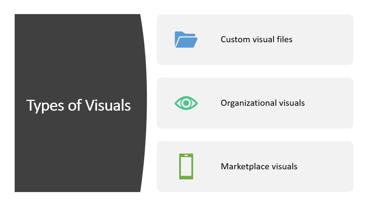
Power BI Custom Visuals
Using bespoke visual files, Power BI apps can display individualized data visualizations (.pbiviz). Developers typically produce these graphics programs and distribute them as .pbiviz files. Customers’ local copies are where the data lives and are accessed by Best Power BI reports.
Organizational Visuals
Association administrative visualizations are created for internal consumption only. All businesses have their procedures and methods for making money. This necessitates using certain applications and methods to achieve their commercial goals. With Microsoft Power BI, you can quickly and easily design engaging visualizations to present your organization’s data trends and key insights. Power BI administrators are in charge of rolling out and managing the organization’s unique visualizations. The Power BI’s administrative portal is where IT staff may stock the organization’s repository with user-created visualizations. Power BI Desktop users and report writers can utilize these individualized data visualizations. Thus, data specialists can now use these visualizations in their reports and analysis.
Market Visual
A team of Microsoft and its community members has tested and approved creative images for the Marketplace. AppSource allows you to create custom PowerBI visualizations and upload them. In this way, Power BI customers can learn new areas of their data by using these custom visuals.
Downloading Custom Visuals from Microsoft Marketplace
From the Microsoft AppSource, you can glance at thousands of customized visuals. You can download and ingress custom Power BI Desktop visuals based on your specific needs and preferences by following the steps in this section.
Steps to see the Available Power BI Custom Visuals
The first step is to visit the Microsoft AppSource website. A new window will appear on the AppSource homepage, as shown in Figure 2.
Follow the Steps from Figure 3 to Figure 7
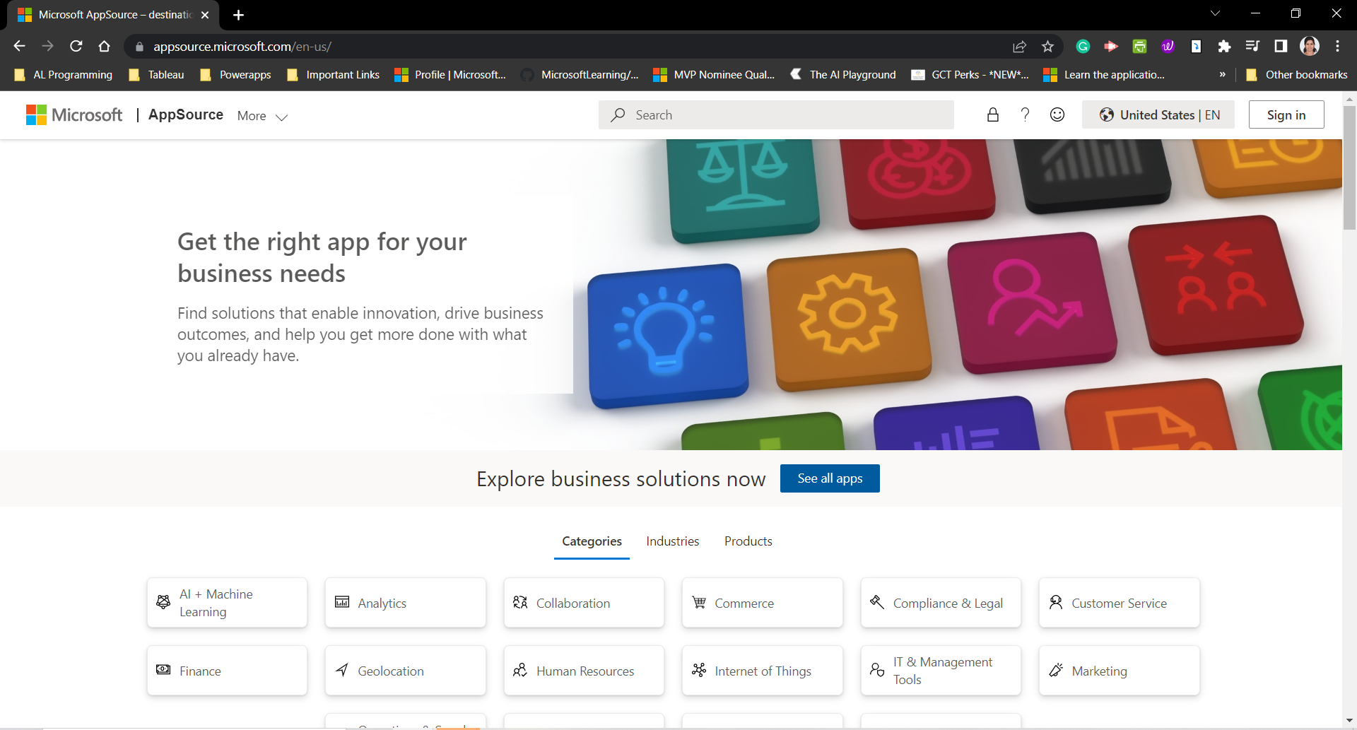
Figure 2: Microsoft App source Home page
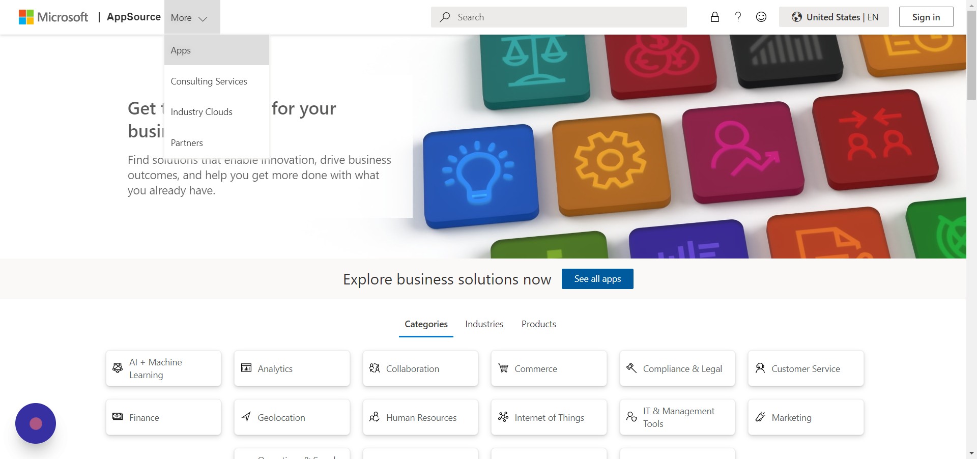
Figure 3: Click More-> Apps

Figure 4: On the left side, expand the Products

Figure 5: Expand Power Platform
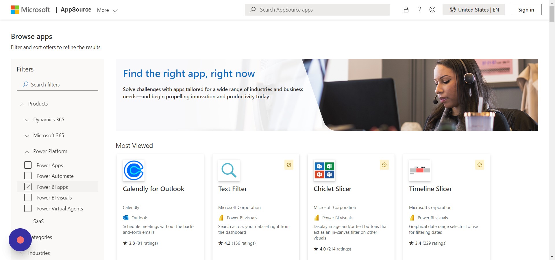
Figure 6: Select Power BI Visuals

Figure 7: You can see Power BI-related visuals on the centre screen
Let’s imagine we wish to use the animated bar chart in our Power BI report. By reading the descriptions of each image, you can choose what you need. Then, select Get it now.
Steps Download Custom Visuals in Power BI Desktop
1 Step: Open the Power BI Desktop
2 Step: Click the three dots (…) in the Visualization pane and click “Get more visuals,” as shown in Figure 8
.png)
Figure 8: Step 2
3 Step: You can search the visuals in the search bar and click the visual that you want, as shown in Figure 9
.png)
Figure 9: Step 3
4 Step: Click add as shown in Figure 10. You can read the complete information about the visual if you want to know more about it.
.png)
Figure 10: Step 4
5 Step: You will get the message as shown in Figure 11. You can find the imported visual in the Power BI visualization pane.
.png)
Figure 11: Success message
Top 5 Custom Visuals in Power BI
Advance Card
The advanced card in Power BI gives you access to various added structures like starting and final labels, conditional formatting, tooltips, and many others that are not included in the default report.
A few of the attributes of Advance Card Visual are:
- Conditions-based formatting
- Prefixes and postfixes are supported
- There are plentiful formation options for content, like centering, left-aligning, or right-aligning.
- Assistance with tooltips
- Background images are supported
- An attack or border manipulation.
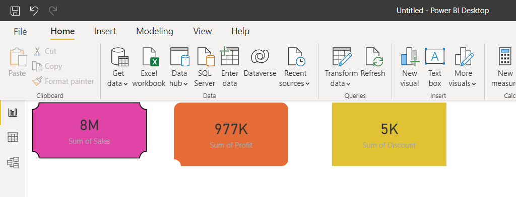
Figure 12: Advanced Card in the Power BI
Use case:
Data can be tracked and displayed in a concise format using cards as a visualization tool. Any measurable aspect of your company’s financial health, such as sales volume, share price, or bottom line, may be the focus of this statement. Exhibiting a single numerical value or the measured value of a number is a common use case. We can also utilize this data to build a report editor or FAQ.
Animated Bar Graph
These charts are predominantly popular on social media because they suggest a comprehensive data story or insight in a clear and understandable graphic. The animated bar chart race allows you to visualize the change in trends over time. There are two ways to use this, you can use the stand-alone mode with Autoplay for animation, or place the ranking bar chart visual on reports and use other filters to loop through the options. Additionally, the chart provides settings for colour, displaying, and walloping more than a few overt labels and indicators. Please refer to the sample report for usage examples and recommendations.
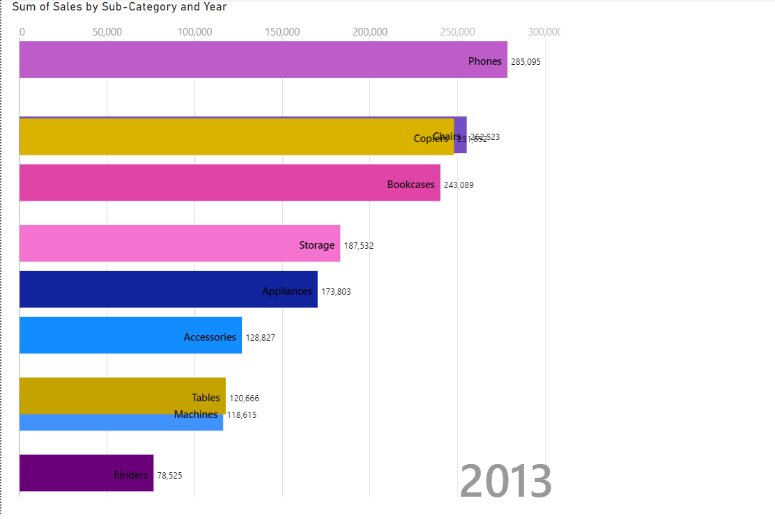
Figure 13: Animated Bar graph
Use Case
Using animation to present visualization tools is a captivating area of study and a highly effective strategy for connecting with people on a more profound, emotional level. Users have a lot of leeway in how they portray their data in data stories. The main idea of Animation is to strengthen dialogue and propel transformation.
When used with visualization, the animation may breathe new life into data for exploratory and presentation purposes. Data visualization that uses animation is more effective at capturing audience attention than static alternatives. Changes can be monitored, for instance, by noting when a certain stage ends and the next begins.
Word Cloud
Word frequency and value are displayed visually in word clouds. Utilize it to gain quick insight into the key terms in your data. The lively Word Cloud feature in Power BI eliminates the need to laboriously sift through voluminous amounts of text to identify the terms that are widespread or notable.
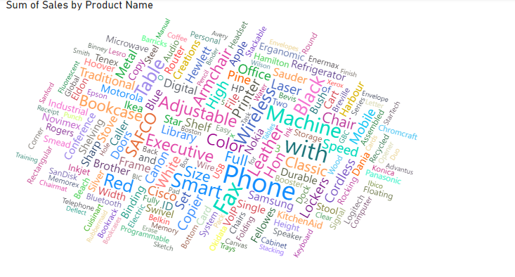
Figure 14: Word Cloud
Word Cloud in Power BI makes finding out which terms are prevalent and dominant in large volumes of text a breeze. By displaying them as Word Clouds, you can get a picture of what’s going on and further investigate themes using Power BI’s interactive capabilities. Furthermore, this visual allows you to customize the appearance of the word cloud, such as the size and sizing of the space, as well as the treatment of data. Depending on your needs, you can decide if you want to break the words in the text to find the frequency word or if you want to keep word breaks off and project the value of the text as the frequency word.
Use Case
In a Word Cloud chart, font size and color indicate the relevance or regularity of particular words, which is a visual representation of text data. The chart displays more significant or frequently used words in larger fonts and bolder colors. Having the listener participate by providing answers makes them feel more engaged. Many people in the crowd are waiting to hear what others in the audience say. Word Clouds are interesting conversation starters and can be used as interactive sessions.
Infographic Designer
The custom visual for Power BI’s infographic creator allows you the ability to accomplish this and more! You may precisely modify the shapes, colors, and arrangement of lists, bar charts, and column charts with the infographic designer’s custom visual, allowing you to show information in a way that best conveys the meaning of your data.
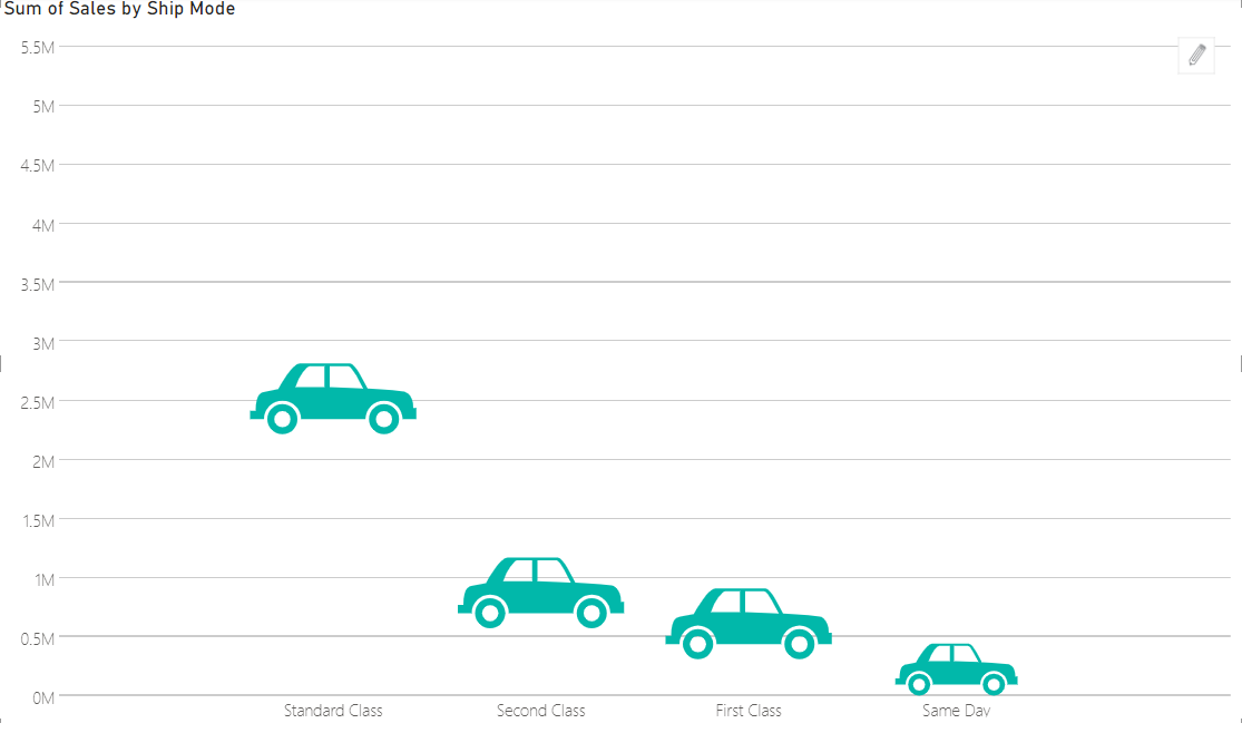
Figure 15: Infographic Designer
By combining precise layout control with the option to insert unique shapes and pictures connectable to data, you can create both straightforward pictograms and intricate, highly customized visuals. To transform data into information, the infographic creator custom visualizes various layout and graphic modification choices.
Use Case
Compared to long paragraphs of text or lists of bullet points, infographics present information in a far more engaging format. They aid in simplifying complex data, making it more readily understandable at a glance through visual features that render abstract data more concrete.
Inforiver
With Inforiver, you don’t need to know DAX or IT to quickly create complex financial statements, P&L reports, management, and variance reports, thanks to our built-in visual formula engine. Inforiver Professional Edition supports the Reporting, Visualization, and Analysis use cases.
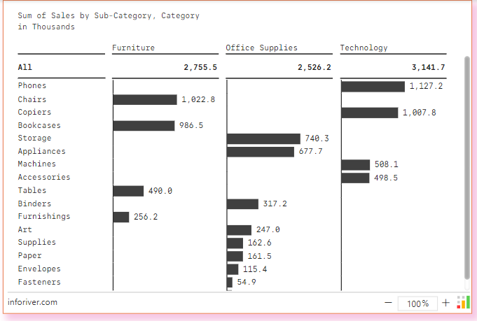
Figure 16: Inforiver
The creative built-in toolbar delivers exclusive end-user self-service, engagement, and collaboration experiences. It proposes alignment, single-click styling, and a variety of formatting possibilities. The professional edition is suitable for creating financial statements with a certain format.
You can create IBCS-compliant visualizations, variance reports, and P&L/financial statements in a single click.
Highlights:
1. Visualizations that can be personalized in a single click:
- For comparison, variance charts include absolute and percentage variances
- Performance bullet charts: 5 types
- Line of sparks, Area of sparks, Win-Loss and their variants (for trends), Column of sparks
- Waterfall chart, stacked chart (for distribution)
- Plots with dumbbells, dots, and arrows (for ranges)
- Magnitudes Bar & Lollipop
2. Reporting with IBCS in one click:
- Hierarchies of rows and columns can be extended and collapsed
- Pages that smartly paginate
- Uniform scaling applied automatically to all numerical formats (IBCS)
- Column and row reordering through mouse-over-and-drag
- Placement (above or below) of grand and subtotals, and breakdown of totals
- A powerful visual formula editor allows you to insert easily, change, and rearrange rows.
- Reflex support for organization structures
- Annotations and notes at the cell level
- Export to Excel with color, conditional formatting, and comments that you pivot on.
- References that don’t need a fancy server or database
Use Case
Businesses that want to create reports anticipate having some leeway regarding format, presentation, and layout. What was once an IT-only feature is now accessible to non-technical users thanks to the rise of low-code and no-code environments. Inforiver offers numerous in-cell visualization for constructing graphic tables. Inforiver’s fully customizable in-cell charts offer a 100% little, if any, coding experience, in contrast to other BI products that require scripting for building complex chart kinds or delivering changes.
Conclusion
Until now, we have only covered the top 5 Power BI customized Visuals and the concept of custom visualizations in Power BI. We hope we have provided comprehensive instructions on applying the visualizations to your business requirements. There are much more Power BI Visuals List and Chart Types available on this Microsoft platform.
Read more about Power BI here.
The key takeaways of these visualizations are:
- Ease of tracking the necessary insights of data
- The perfect chart will make a good understanding of the key events and data.
- Using various charts can show up the data store.
We will get back to you if you leave a message below for the queries.
Analytics Vidhya does not own the media shown in this article, and the author uses it at their discretion.


