This article was published as a part of the Data Science Blogathon.
Introduction to Data Storytelling
Storytelling is a beautiful legacy that is a part of our great Indian culture, from the legendary Mahabharata era to Puranas and Jataka fables. Stories have been an imminent part of childhood, and the most important morals and values were bestowed on us through the art of storytelling. Believe it or not, the power of a story can tell you a lot in little.
Leo Widrich, an entrepreneur, in his paper “The Science of Storytelling: What Listening does to our Brain”, explains that listening to something activates our brain and instils a sense of belonging with the story’s plot. Let’s say the storyline says, “Sam pushed himself again at the gym”, which activates the sensory cortex of the listener, leading to a more enriching experience. Chemicals like cortisol, dopamine and oxytocin are considered to be released when listening to a story. Cortisol helps in memory retention of a particular plot of a story, while dopamine is a controller of emotional responses that helps engage for a long time. The release of oxytocin is imminent in maintaining deeper, rich and more effective connections.
That said, this understated art of storytelling is relevant to customer retention for businesses. Combined with the power of Data, the art of storytelling can revolutionise the way business reports and dashboards are read. From Marketing to Sales, healthcare & life sciences solutions to disrupting the travel and tourism industry, data stories are bridging the gaps in moving from old-school plain PowerPoint presentations to dynamic visualisation dashboards. But, what stands for a good, succinct data story, needs to involve some important components.
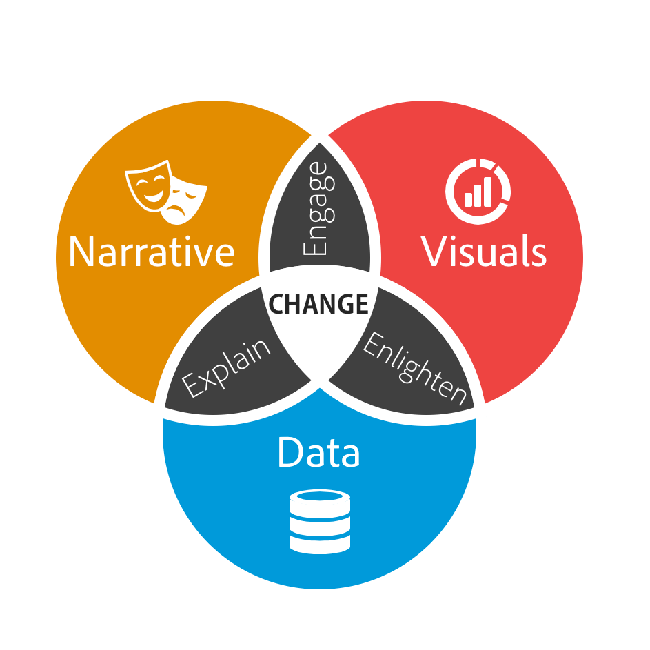
The three components – Data, Narrative and Visuals form the basis of data storytelling.

Data Cleaning
This first step can be a little boring yet relevant simultaneously. Most of the time, the data we get to work on is littered with unwanted, unnecessary data that, if ignored, can lead to unsatisfactory results. This can lead to bad marketing & sales and, eventually, low turnaround. This is what makes data cleaning a crucial step. That being said, the following are the 6 important steps in data cleansing.
According to some internet reports, around 2 – 3 trillion pieces of data are generated daily. Sounds too much, right? This data is, however, unstructured and not fit for its first use. To get this data working, we need to make it go through some cleaning.
1. Checking on Null/NaN Values:
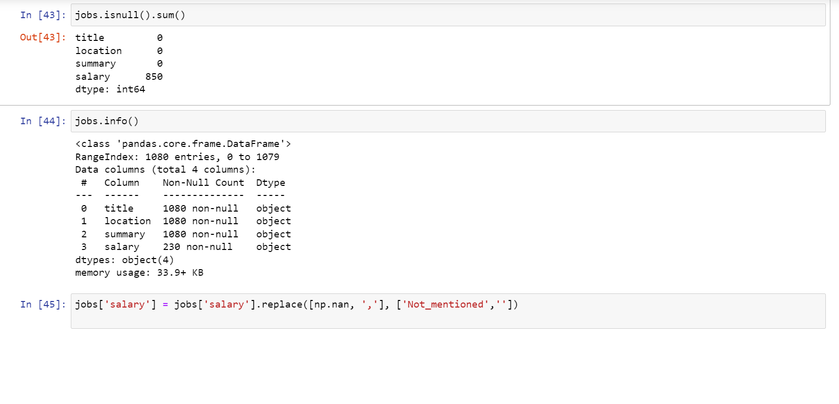
Null values, that is, values that reflect “NaN/null is considered null values. These values have no relevance to the significance of the data and the value it is about to convey. Removing them is necessary as it can help maintain the quality of the data. We may either replace these null/NaN values or, depending on the usability of the data, remove them.

2. Removing Unnecessary Data:
The possibly two types of unnecessary data are – duplicates and redundant data. As it goes with the duplicates, it increases the redundancy of the overall dataset. As far as redundant data is concerned, it requires us to have a thorough business understanding and the data value the key stakeholders are looking for.
3. Working on the Data Structure:
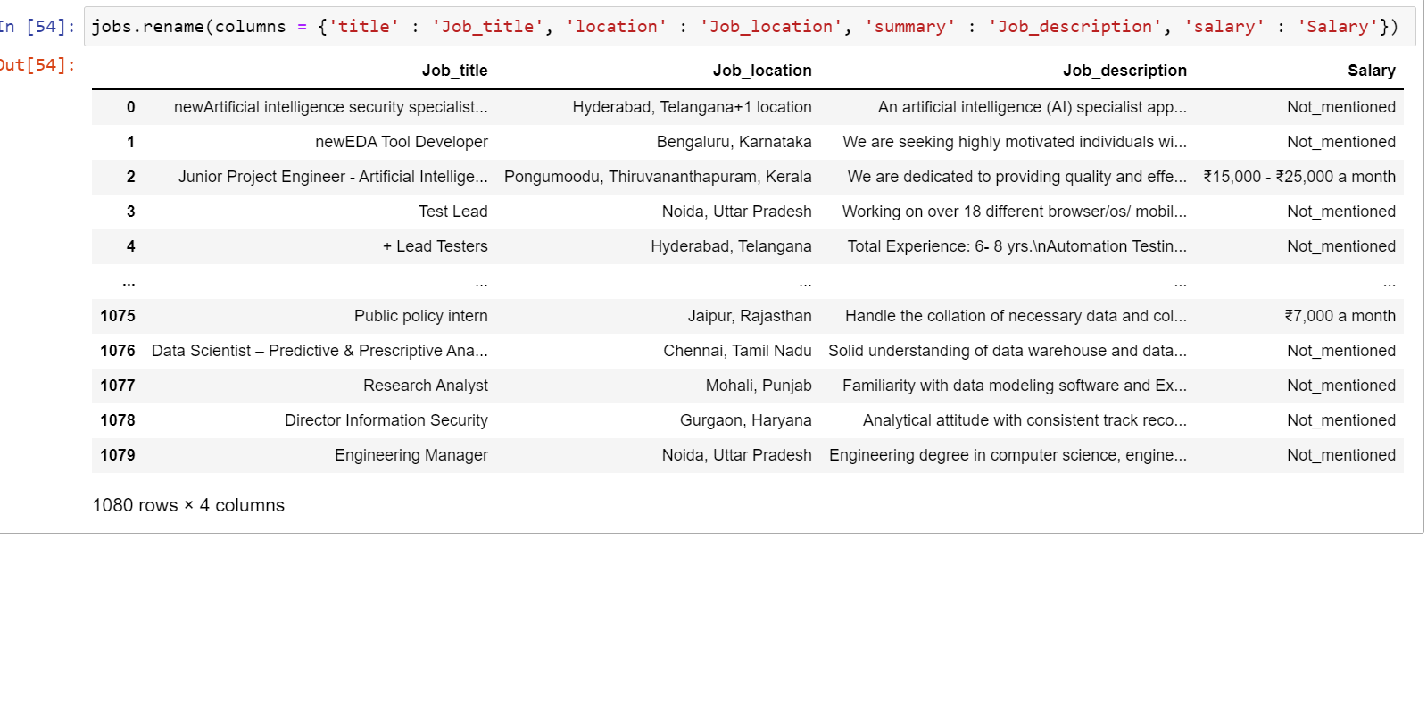
This involves working on grammatical errors, spelling errors, and wrong use of words/conventions. This might sound like simple English, but imagine its impact on the humongous data that is majorly being processed in English across the world. This step involves renaming the columns according to conventions, changing the datatypes of the data and adding or deleting unnecessary fields and attributes. It is a mandatory step as keeping the language of the data intact helps design and train the ML model in a better and more effective way.

4. Filtering Out Missing Data:
Unlike null values, this is a step where we target the fields with no values, simply blank. To connect the dots with the available data, we must filter out the missing data and prepare it for preprocessing.
5. Filtering Out Outliers:
Outliers are values far from the convention that the rest of the data has set up. These values can skew the data without any direction or purpose and hamper the analysis. One of the most effective ways to look out for the outliers in the dataset is by performing EDA, which is Exploratory Data Analysis. However, this does not mean that the outlier data should never be considered. It depends on the analysis and model we run and its training requirements.
6. Validating the data:
This is the final step of the data cleansing process, and here is where we now conclude on our data for its uniformity, quality and integrity. This phase mostly involves answering questions like:
- Is the cleansed data enough for making an effective analysis or training a machine learning model?
- Is the data uniform in its structure?
- Is there still any redundant data in the dataset?
This may seem an enduring process, but it is worth every second you spend on it for any organisation and individual satisfaction. Once this big chunk of data passes through these 6 essential steps, it is ready for some good analysis and beautiful visual presentations that make the data talk!
Data Visualization
Let’s get the data talking with some of the most prominent data visualisation tools used by the industry to create some inspiring and appealing data stories. This is the most important step in the entire data storytelling journey. While Python has some efficient libraries like Matplotlib and seaborn for visualising the data, they lack the ‘dashboard experience’ that gives an edge on business decision-making.
Some of the famous and in-demand tools that fill this gap for a smooth, dynamic and real-time dashboard experience and for that edge-on, cut-on-cut analysis include, but are not limited to, Tableau (powered by Salesforce), Power BI (powered by Microsoft), Data Studio (Google), Qwiklabs, Looker, etc. While Tableau & Power BI are the most loved Data Visualization applications, others on the list also get through well.
However, even before getting to the canvas to design the dashboard, certain points need to be taken care of.
Key Steps in Data Visualization
1. Review your data once again:
No matter how excellent your data cleaning and modelling skills are, reviewing the data once again is always a good idea. The points that need to be considered at this stage are the relevancy and redundancy of the available data. It is always a good idea to modify the otherwise technical, unreadable attributes with more readable and easy-to-understand words to make the dashboard or reports more comprehensible.
2. Make your data go through the W-W-H method:
It is extremely critical to formulate precise and articulate questions to answer the burning questions that the data is supposed to be answering and derive insights from it. One of the simpler methods is the W-W-H – What-Why-How method. This method can be excellent for pre-production as well as post-production business analysis.
Take the instance of an Xyz pharmaceutical company on research for making a new drug. In this case, the first subject of the research should understand the current market, customers’ behaviour towards various pharma brands and available drugs and lastly, the current healthcare situation in its geography/region of interest. This is the ‘WHAT’, the first component of the method.
After gaining a thorough understanding of the above points, comes the stage to ask, ‘Why do we want to build this product?’ The second step of this method, the ‘WHY’ starts with this question, why do we want to build or design something? Clear objectives can help drill down the analysis on the dashboard and reports.
Finally, the ‘HOW’- is the most crucial and most interesting part of the method. After the above research and analysis, we can go ahead with deriving some of the most powerful insights from our data. The ‘HOW’ helps gain a detailed perspective on
1. The potential of the product in terms of its geographical range
2. The ever-changing dynamics of the retail, digital & e-commerce
3. Performance comparison of the current market competitors and so on.
3. Make sure to enable row-level security:
To maintain the integrity and security of the data, it is always a good idea to define roles and rules at the dashboard level. After defining the roles, one should always validate or test the rules for different user roles you define for various user groups at the organisational level. This can be easily achieved through Data viz tools like Power BI, Looker and others.
Conclusion to Data Storytelling
By this time, we learned much about storytelling’s ancient and natural art. In the second part of this blog, we related this art with technology to learn about Data Storytelling. Along with the basics, we also understood why it is important to learn this understated soft skill that is extremely necessary for anyone to have a successful career in Data Science. In the third part of this blog, we learnt in detail about the components of Data Storytelling, from data cleaning to visualisation.
By now, we must have understood that the skill of Data storytelling is critical and significant not just for the Data/AIML Scientists or Analysts but for every professional from all the sectors we can think of. Data, being the oil of Industrial Revolution 4.0, must be utilised robustly. This requires every IT/Non-IT, private or public sector professional and even entrepreneur to learn and develop their data storytelling skills to make sense of trillions of data received from multiple sources. This is one skill that can enhance the value of the technical knowledge one may possess. Moreover, as we learnt above, data storytelling is also helpful in aiding us to learn the ‘Art of Questioning the Data’, where the entire analysis may start.
To continue our learning, the next part of this blog will teach you how to build a powerful post-Sales Analysis Dashboard and build data narratives around it. And always remember. The journey of learning something new is always challenging but worth it!
The media shown in this article is not owned by Analytics Vidhya and is used at the Author’s discretion.


