This article was published as a part of the Data Science Blogathon.
Introduction
Hey, are you working on a data science project, solving a problem statement related to data science, or experimenting with a statistical test to make further decisions and handling the most repeatedly cited statistical term, ‘correlation’? Willing to correctly interpret these statistical terms (covariance, parametric and non-parametric correlation)? Confused about understanding assumptions before selecting an appropriate method? Which method will outperform or underperform in your problem statement in a specific scenario (i.e., sensitive to outliers, type of distribution, etc.)? Working on sample data and willing to know the probable error of the coefficient? ……so on….?
….” then, trust me, this article will help you to concrete your understanding of all these statistical terms along with their application’…”
Yet, ‘correlation’ is not only limited to doing filter based features selection techniques to reduce redundant or unnecessary features to save computational cost and improve model efficiency but helps derive final business outcomes (for example, in Agriculture like the number of fertilizers and crop yield, in medical like New drug and % of patients cured, in Operation like welfare expense and productivity, etc., in sociology like unemployment and crime, etc., in Economics like price and demand, etc.). Hence, it becomes easier to make further decisions to consider or reject the variables/features based on certain threshold values at the discretion of domain expertise and data scientist.
This article will cover the following topics to strengthen our understanding.
-
-
- Covariance, correlation, and their significance
- Parametric (linear) correlation and its coefficient (Pearson)
- , Non-parametric correlation (non-linear) and their coefficient (Spearman and Kendall)
- Group Correlation
- Probable Error of Coefficient of correlation
-
So let’s get started and do some hands-on!!!
Before we understand the correlation, let’s try to understand the covariance term and its limitations.
What is Covariance?
Covariance measures the strength of the relationship between two numerical variables and their tendency how they moving together. But their interpretation is not easy to derive any insights about it.
Covariance between sample variables x & y can be mathematically formulated as per the below equation.

Equation-1: Covariance of sample X and Y Variables, n-1 represents a basal correction
Let’s try to understand covariance with the below example.
A sample dataset has been taken just to experiment with three possible correlations between NBA Team revenue and NBA Value in a different scenario:
import pandas as pd
import matplotlib.pyplot as plt
import seaborn as sns
d1 = pd.read_excel(r"C:Users..Covariancedata.xlsx",sheet_name='d1')
d2 = pd.read_excel(r"C:Users..Covariancedata.xlsx",sheet_name='d2')
d3 = pd.read_excel(r"C:Users..Covariancedata.xlsx",sheet_name='d3')
d1.shape, d2.shape, d3.shape
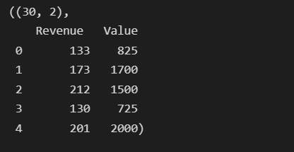
Data Source :
d1.cov().round(2)
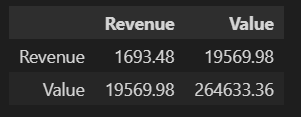
Covariance is any numeric value (in our case, it is 19,569.98), so it is impossible to determine the strength of the relationship based on these values; hence the coefficient of correlations is considered to get the correct value. Before we understand the it, let’s try to understand the correlation.
Correlation
Correlation is statistics intended to quantify the strength of the relationship between two variables. Practically, measuring the relationship between two variables is never that easy as, in many cases, both variables have different scales and units following dissimilar distributions. Based on the distribution and type of relationship, correlations can be interpreted in two categories as follows.
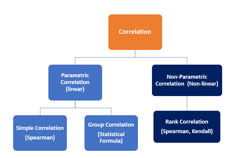
Parametric (Linear) Correlation
The below sketches show a glimpse of the linear correlation between two variables. However, for continuous variables that are linearly correlated, the correlations formed between them can be interpreted as a Parametric (linear) correlation, and the strength of the relationship can be measured using Pearson’s Coefficient of correlation.

Pearson’s Coefficient of Correlation :
To calculate the correlation between two series (say variables x & y), the coefficient of correlation is calculated by dividing the covariance of the intended variables (suppose x and y) by their standard deviation respectively, and given mathematical expression measures the relative strength of a linear relationship between two variables ranging (-1 ≤ r ≤ 1) where -1 for perfect negative correlation and +1 for perfect positive correlation and is known as Pearson’s Correlation coefficient.
This means that the variable x and y move together at a constant ratio and are denoted by ‘r’.
.png)
Equation: 2 Pearson Coefficient of correlation
Before using Pearson’s Correlation, the following assumptions must be checked :
(1) The relationship between two variables (say x & y) must be linear, where the amount of variation in x bears a constant ratio to the corresponding amount of variation in y.
(2) Both the variables shall be approximately Normally distributed
Using the seaborn library, we can calculate the correlations with a single line of code as below:
sns.heatmap(d1.corr(method='pearson'), annot=True)
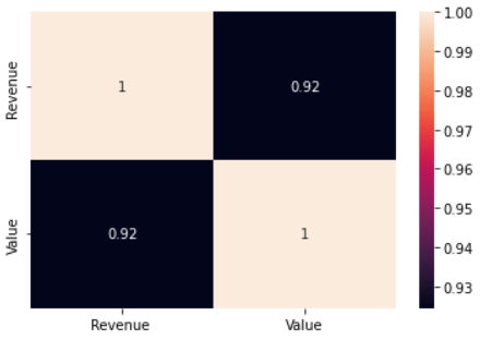
Plotting the few possible correlations using regplot. However, scatterplot also does the job! represent the same.
plt.subplots(figsize=(10,5))

plt.subplot(1,3,1)

sns.regplot(x = d1['Revenue'], y=d1['Value'], color='Green')

plt.title('Possitive Correlation/Correlation Value : 0.92', fontsize=(15))

plt.xlabel('Revenue', fontsize=(15))

plt.ylabel('Value', fontsize=(15))

plt.subplot(1,3,2)

sns.regplot(x = d2['Revenue'], y=d2['Value'], color='blue')

plt.title('No-correlation/Correlation Value : 0.07', fontsize=(15))

plt.xlabel('Revenue', fontsize=(15))

plt.ylabel('Value', fontsize=(15))

plt.subplots_adjust(bottom=0.1, right=2, top=0.9)

plt.subplot(1,3,3)

sns.regplot(x = d3['Revenue'], y=d3['Value'], color='red')

plt.title('Negative Correlation/Correlation Value : -0.88', fontsize=(15))

plt.xlabel('Revenue', fontsize=(15))

plt.ylabel('Value', fontsize=(15))

plt.subplots_adjust(bottom=0.1, right=2, top=0.9)

Non-Parametric (Non-linear) Correlation
Getting Pearson’s coefficient value near zero emphasizes not correlating two variables. Still, it doesn’t validate the proof as it only measures linear correlations and understates the strength of the relationship for non-linearly correlated variables. Hence limitations of Pearson Correlations are overcited by Non-Parametric Correlation called Ranked Correlation coefficient, which is based on the ranking of the variables. This was introduced by Charles Edward Spearman and known as Spearman’s Rank Correlation.
Spearman’s Rank Correlation:
For distribution-free data (Ranked Data), nonparametric statistical methods are used to measure the degree of correlations between two ranked variables. The rank correlations can be evaluated in discrete series qualitative in nature. It can be calculated with the help of the following mathematical expression: It is denoted by R, and its value lies in the closed interval (-1 ≤ R ≤ 1). Spearman correlation
Application: Helps measure qualitative correlation, i.e., Beauty Score, intelligence (IQ), Merits, etc.

Equation-3: Spearman Rank Correlation of coefficient
Ri = Symmetric difference between two sets of ordered pairs (Say x – y)
n = number of observation
Just for ref., a few sketches show zero correlations between two variables having a non-linear relationship.

Let’s try to experiment with both parametric and non-parametric on the dataset (steel scrap sales) using sing a scatter plot to check linear correlations and a distribution plot to check the distribution of both ‘Rate’ and ‘Quantity.’
df1 = pd.read_excel(r"C:UsersshailGoogle Drive22-23Scrapcleaned_Qty_rate.xlsx")
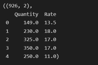
df1.shape, df1.head()
sns.scatterplot(x=df1['Quantity'], y=df1['Rate'])
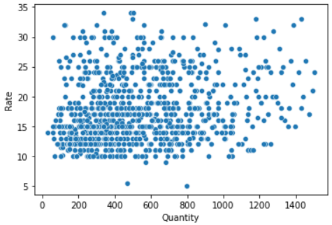
Let’s try to check the second assumption (variables are approximately normally distributed or not) of Pearson using a distribution plot.
plt.figure(figsize=(15,5))
plt.subplot(1,2,1)

sns.distplot(df1['Quantity'])

plt.subplot(1,2,2)

sns.distplot(df1['Rate'])
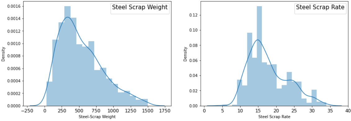
Undoubtedly, looking at the above distribution, it doesn’t meet the assumption of Pearson’s Correlation due to (1) Having skewed distribution and (2) having No linear relationship. Still, we would like to check both Pearson and Spearman Correlation Coefficients.
print('Pearson:', df1.corr(method='pearson'))
print('n')
print('Pearson:', df1.corr(method='spearman'))
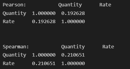
Looking at the above results, Spearman’s coefficient shows a better correlation strength of 0.21 instead of Pearson’s coefficient of 0.19.
Kendall’s Coefficient of Correlation:
It measures the degree of similarities between two sets of ranks. It can be derived by normalizing the symmetric difference such that it will take values between -1 for the largest possible distance (when order/rank are exactly reverse) and +1 for the smallest possible distance. Zero in this case, represents both sets are identical. It can be mathematically expressed as:

Here, P1 and P2 are two sets of ordered pairs
d∆ (P1, P2) is the symmetric difference between two paired sets P1 and P2
1/2* N(N-1) represents the maximum number of pairs that can differ between two sets
Let’s see the implementation part referring to one example to calculate correlations for Rank Data (Ordinal Data) where the ranking of 10 trainees (Dataset 4) in two skills, namely ‘Programming’ and ‘Analysis’, is given.
d4=pd.read_excel(r"C:Users..Covariancedata.xlsx", sheet_name='d4')
d4.head()
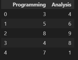
Here, we will apply both Non-parametric methods to check coefficient correlations using a single line of code. So simple !!
print(d4.corr(method='spearman'))
print(d4.corr(method='kendall'))
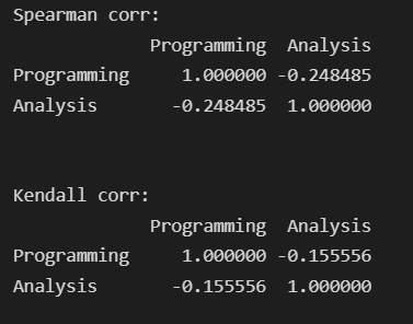
Hence, both method has different results where spearman’s coefficient correlation gives a correct negative correlation of -0.24 instead given by Kendall’s coefficient calculated at -0.15. So depending on the data, problem statement, and outcomes, an appropriate method to be selected interchangeably.
The Probable Error of the Coefficient of Correlation
Practically, we work on sample data due to limitations in accessing population data; hence to reduce to chances of error in calculating the co-efficient of correlation, the probable error comes into existence which can be mathematically expressed as below:
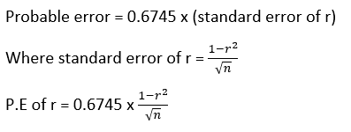
In our case, the probable error may be high due to fewer data samples available, but as the sample increases, the probable error will decrease accordingly. So having said this, the larger the sample better the coefficient of correlation can be represented through the below mathematical expression.
In our case, for dataset/d1 (NBA Team revenue and value), let’s check the Probable Error as we are dealing with a limited dataset. Here we have assumed that the distribution of both variables is normal.

Probable error calculation can only be used when the whole data is normal or near normal.
[Note: The coefficient correlations are only significant if r > 6* PE ]
In our case, the probable error is not significant as r (0.92) > 0.108 ( 6* 0.018)
Group Correlation
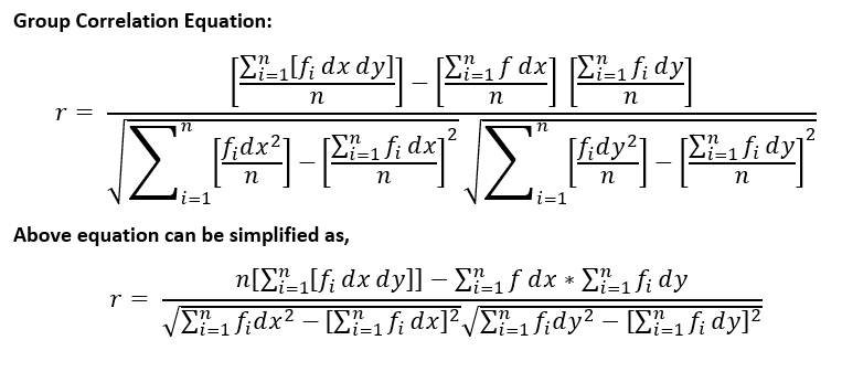
This measure can be evaluated in the continuous series of grouped data, denoted by r, and values of r lie in the closed interval ((-1 ≤ r ≤ 1). Larger the value of r, the stronger the relationship between x and y.
For example, consider a survey report (dataset5) of a totally or partially blind Age group from 0 years to 80 years; the below data has been recorded to check the Group correlation:
d5=pd.read_excel(r"C:Users...Analytics VidhyaCovariancedata.xlsx", sheet_name='d5')
d5.head()
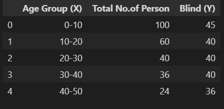
From the above data, considering class interval (h= 10) and any middle value (A=45 and B=1.5) for Variable X and Y are taken to calculate deviation in x and y as dx and dy with ref. to their Middle-value A & B. For ease of understanding, I have used excel sheet to show the calculation as observations are fewer to calculate. By defining functions in python same can be done easily.

Calculating the group correlations using equation 5:

Hence it can be concluded that a strong positive correlations exists between age group and blindness.
Summarizing the above learning for Parametric and Non-Parametric correlation accordingly to methods, assumptions to be met, characteristics, etc.
| Assumptions/Characteristics/ Methods | Parametric Correlation |
Non-Parametric Correlation |
| Methods / Metrics | Karl’s Pearson Correlation |
Spearman & Kendall’s correlation (interchangeably used) |
| Assumption (1) | Must be continuous numeric variables |
Ranked Value, Ordinal data |
| Assumption (2) |
Variable forms linear relationship (positive or negative) | Forms monotonic Relationship |
| Assumption (3) |
Both Variables shall follow an approximately normal distribution |
Distribution free Variables may form a skewed distribution or uniform |
| Characteristics | Both variables move at a constant ratio & follow linear correlation (i.e., y = mx, etc. ) |
Variables move at a constant ratio but do not follow linear correlation; instead, follow the exponential, curve, parabola, etc. (i.e., y = ax+bx^2, a=b^2) |
| Impacted by/Sensitive to: | Outliers must be handled as it greatly affects the correlation |
Robust and Mitigates the effect of outliers |
| Range | -1 ≤ r ≤ 1 | -1 ≤ R/T ≤ 1 |
Conclusion
After experimenting with some hands-on mathematical intuition and definition, we conclude that the coefficient of correlation shows the strength of the relationship between two variables before that certain assumption is mandatory to be met to get the correct output.
Key takeaways from this article can be further summarised below:
- Two assumptions must be checked for continuous numerical data before applying Pearson Correlation. If the variables do not follow it then based on the data type, apply spearman /Kendall matrices.
- For distribution-free (ranked /ordinal) data, either ‘Spearman’ Or Kendall’s correlation coefficient can be used interchangeably. Spearman’s Method is easy to understand and interpret than Kendall’s.
- While dealing with Real-Life Problem Statements, the threshold for rejecting/dropping variables based on their correlation coefficient is to be set by domain expertise and data scientists based on their subjectivity and contextuality.
- For Group Data, especially for an odd number of observations, the selection of the middle value (A & B in our case) is to be validated by repeating the calculation. (in our case, having 8 number observations, either the 4th or 5th observation shall be taken to check the outcome. Here we have opted for the 5th observation as the middle value).
- Strong positive or negative correlations play important roles in business; hence their interpretation also needs in-depth knowledge about the specific domain.
Like and comment if you find this useful. Feel free to connect with me!!
Happy learning!


