Introduction
This article describes Gantt charts and emphasizes how important they are for creating project schedules. It also shows how they can show timeframes, dependencies, and tasks. It offers detailed instructions for making Gantt charts with Python’s matplotlib and plotly tools. Also demonstrating how to use them to efficiently and effectively display project timelines.
Overview
- Learn about Gantt charts, their elements, and the significance of project management with them.
- Learn how to use the Python matplotlib library to build and modify Gantt charts.
- Develop skills to create interactive and visually appealing Gantt charts using the plotly library.
- Learn to identify and visualize task dependencies and project timelines effectively using Gantt charts.

Table of contents
Gantt Charts in Python
Gantt chart – your go-to tool for mapping out project schedules and keeping your team on track! This versatile visualizer, named after Henry L. Gantt is all about showing tasks and their dependencies in a clear and concise way.
A typical Gantt chart features horizontal bars that represent individual tasks or events, with start and end dates that give you a birds-eye view of the project timeline. It’s like having a roadmap to your project’s success! With this chart, you can:
- Spot relationships between tasks.
- Identify dependencies.
- Create a realistic schedule that keeps your project on pace.
With the aid of these effective tools, you can create charts that are easy for everyone to comprehend and that look fantastic.
Creating Gantt Charts using Matplotlib
Let’s now look at how to use the matplotlib library in Python to produce Gantt charts.
import matplotlib.pyplot as plt
import pandas as pd
import matplotlib.dates as mdates
# Define the data
df = pd.DataFrame([
   dict(Task="Job A", Start='2009-01-01', Finish='2009-02-28'),
   dict(Task="Job B", Start='2009-03-05', Finish='2009-04-15'),
   dict(Task="Job C", Start='2009-02-20', Finish='2009-05-30')
])
# Convert Start and Finish to datetime
df['Start'] = pd.to_datetime(df['Start'])
df['Finish'] = pd.to_datetime(df['Finish'])
# Calculate the duration
df['Duration'] = df['Finish'] - df['Start']
# Create the figure and axis
fig, ax = plt.subplots()
# Create bars for each task
for i, row in df.iterrows():
   ax.barh(row['Task'], row['Duration'].days, left=row['Start'])
# Format the x-axis as dates
ax.xaxis_date()
ax.xaxis.set_major_locator(mdates.MonthLocator())
ax.xaxis.set_major_formatter(mdates.DateFormatter('%Y-%m-%d'))
# Set labels
ax.set_xlabel('Date')
ax.set_ylabel('Task')
ax.set_title('Gantt Chart')
# Invert the y-axis to have the tasks listed from top to bottom
ax.invert_yaxis()
# Rotate date labels for better readability
plt.xticks(rotation=45)
# Show the plot
plt.tight_layout()
plt.show()
Output:
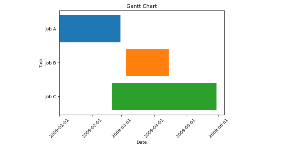
Here, matplotlib’s `subplots` function is used to create a figure and an axis.
The figure will contain the Gantt chart. A loop iterates over each row in the DataFrame, creating a horizontal bar (h-bar) for each task using Matplotlib’s `barh` function. The height of each bar is set to the duration of the task, and the left edge of each bar is set to the start date of the task.
Note: The time duration of each task goes from start to finish.
Creating Gantt Chart using Plotly
Let’s now look at how to use Plotly library in Python to produce Gantt charts.
import plotly.figure_factory as ff
df = [dict(Task="Job A", Start='2009-01-01', Finish='2009-02-28'),
     dict(Task="Job B", Start='2009-03-05', Finish='2009-04-15'),
     dict(Task="Job C", Start='2009-02-20', Finish='2009-05-30')]
fig = ff.create_gantt(df)
fig.show()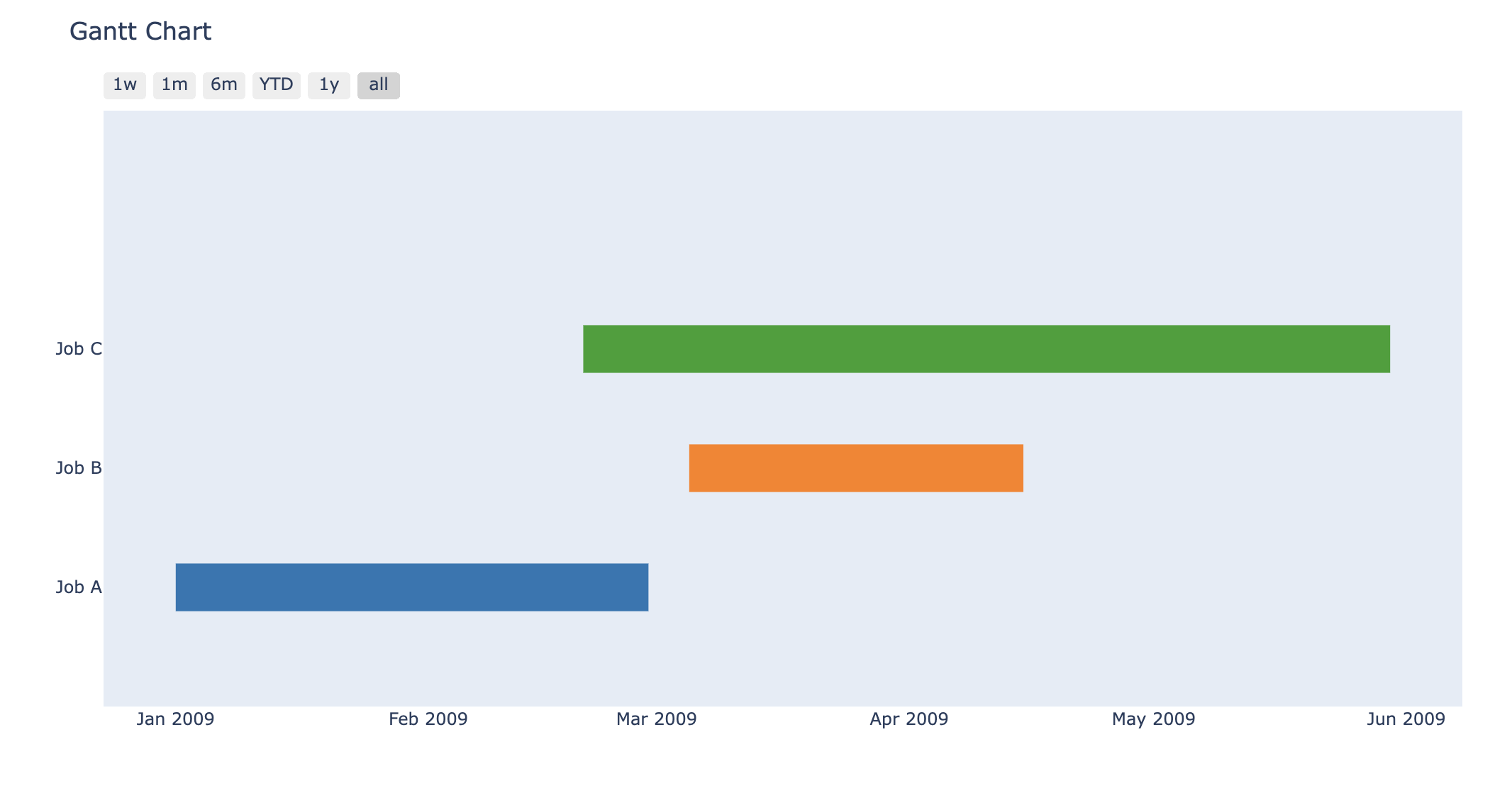
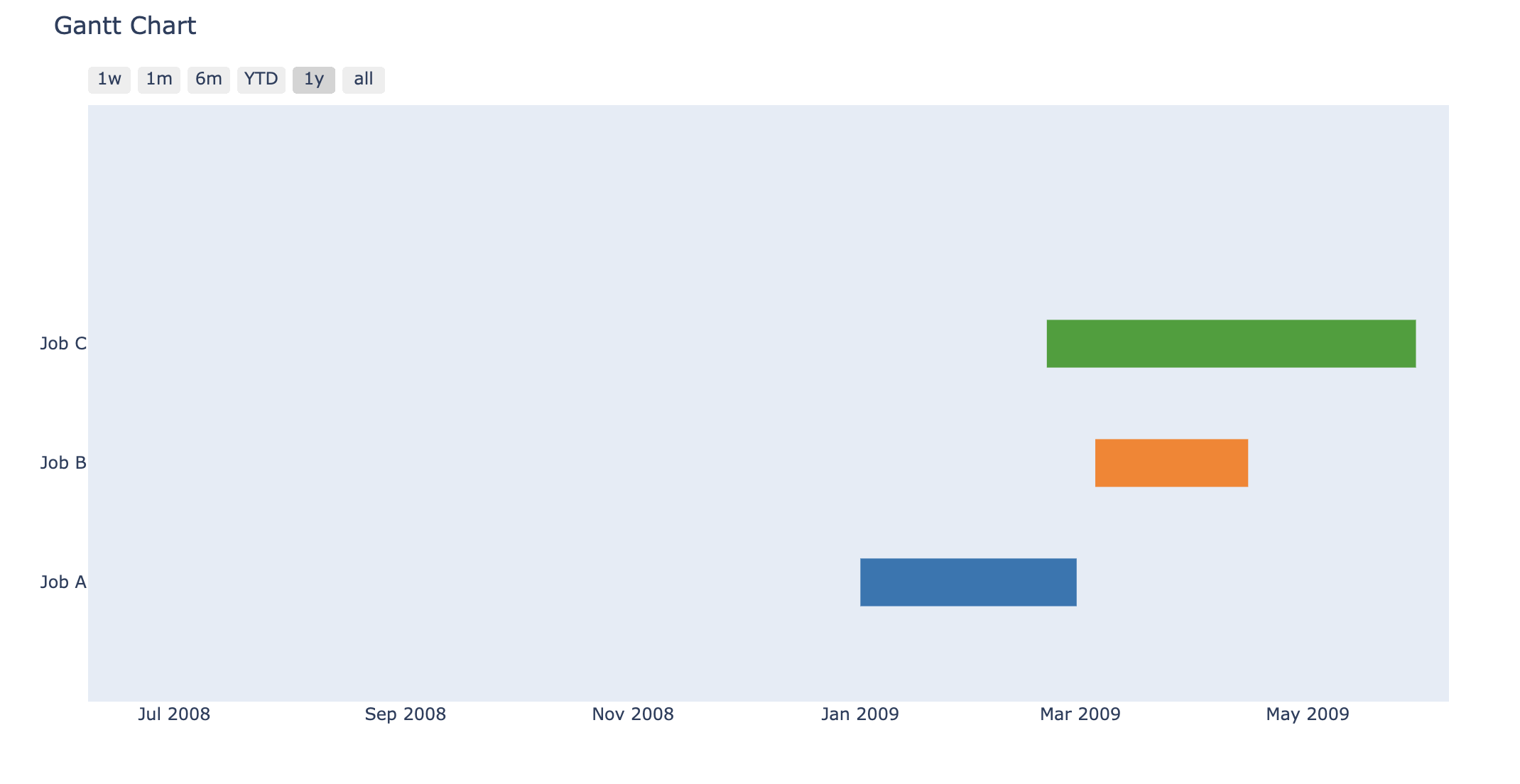
As you can see ‘plotly’ provides a nice implementation of Gantt charts with much simpler syntax and customization of the time frame. The charts generated by plotly are also downloadable.
Conclusion
Gantt charts are incredibly useful tools for displaying job progress, dependencies, and project schedules. You may make highly configurable and interactive Gantt charts that improve project planning and tracking by utilizing Python packages such as matplotlib and plotly. In this article we explored creating Gantt charts in Python.
Frequently Asked Questions
Q1. What is a Gantt chart?
A. Gantt charts show the sequence, duration, and dependencies of activities with each work represented by a horizontal bar and displayed on a timeline. They are visual project management tools that facilitate understanding.
Q2. How can I create a Gantt chart in Python?
A. You can create Gantt charts in Python using libraries like matplotlib and plotly. Matplotlib offers extensive customization options and is great for static charts, while plotly provides interactive charts with a simpler syntax, allowing for easy updates and data visualization.
Q3. What are the advantages of using plotly for creating Gantt charts?
A. Plotly has a number of benefits, such as easily customizable and updatable charts, easy use, and interactive and aesthetically pleasing charts. Plotly charts are flexible for a range of use cases since they can be downloaded and included into online apps.
Passionate about technology and innovation, a graduate of Vellore Institute of Technology. Currently working as a Data Science Trainee, focusing on Data Science. Deeply interested in Deep Learning and Generative AI, eager to explore cutting-edge techniques to solve complex problems and create impactful solutions.


