Introduction
This post provides a thorough tutorial on using Matplotlib, a potent Python data visualization tool, to create and modify line plots. It covers setting up an environment, generating sample data, and constructing basic graphs. Additional modification methods covered in the guide include altering line styles, plotting multiple lines, adding markers, and adding annotations. In this article we will explore line plot using matplotlib in detail.

Overview
- Learn the basics of setting up the environment and importing the required libraries when using Matplotlib to create line plots.
- To ensure clear data representation, learn how to create sample data using NumPy and visualize it using simple line plots.
- Develop skills to customize line plots by altering line styles, colors, and adding markers, making plots more visually appealing and informative.
- Acquire the ability to plot multiple lines on a single plot to compare different datasets, enhancing your data analysis capabilities.
- Master the techniques to add annotations to highlight key data points and save plots as image files, facilitating better data communication and documentation.
Table of contents
Setting Up Your Environment
Before you begin, ensure you have the necessary libraries installed. You can install Matplotlib using pip if you haven’t already:
pip install matplotlibImporting Libraries
First, import the required libraries. The main plotting package is Matplotlib, while NumPy can be used to create example data.
import matplotlib.pyplot as plt
import numpy as np
Generating Sample Data
For demonstration purposes, let’s generate some sample data using NumPy. We’ll create a simple dataset representing a sine wave.
# Generate 1000 evenly spaced values from 0 to 10
x = np.linspace(0, 10, 1000)
# Generate corresponding sine values
y = np.sin(x)
Creating a Basic Line Plot
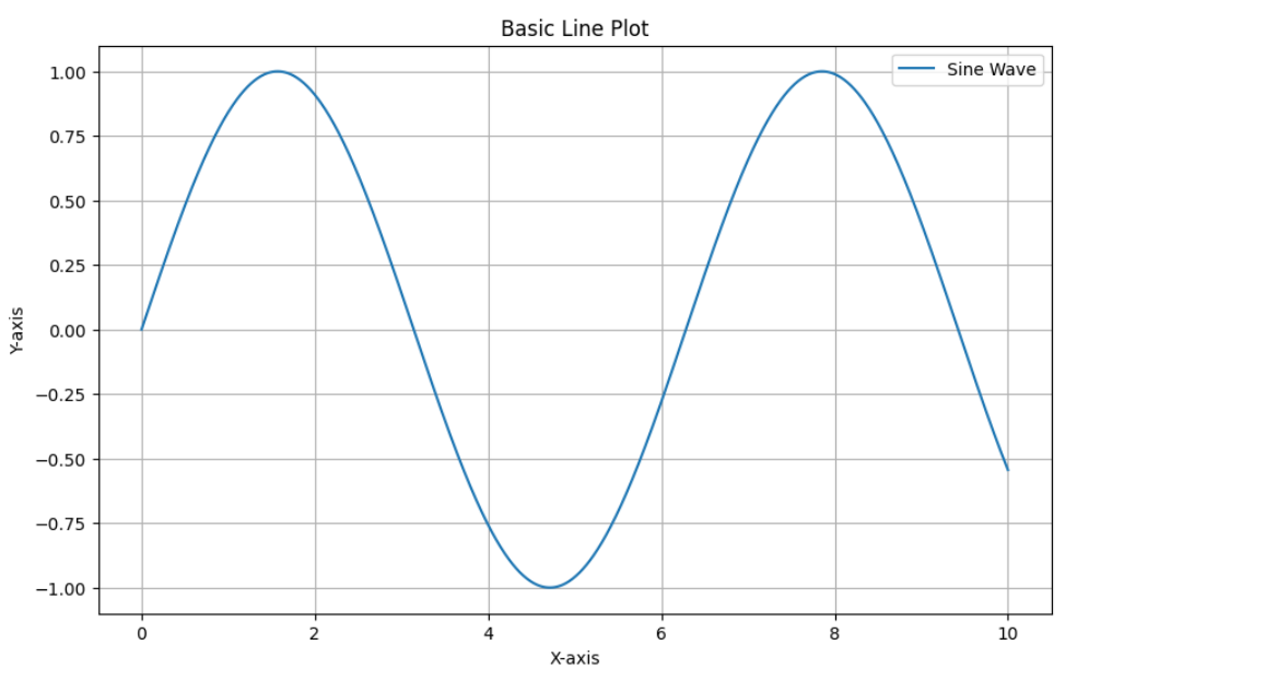
We will now create a basic line plot using Matplotlib. We will learn how to generate a simple yet informative line plot using Matplotlib. By providing a clear and concise representation of the data.
plt.figure(figsize=(10, 6))  # Set the figure size
plt.plot(x, y, label='Sine Wave')  # Plot the data and add a label
plt.title('Basic Line Plot')  # Add a title
plt.xlabel('X-axis')  # Add X-axis label
plt.ylabel('Y-axis')  # Add Y-axis label
plt.legend()  # Display the legend
plt.grid(True)  # Add grid lines
plt.show()  # Display the plot
Output:
Customizing the Line Plot
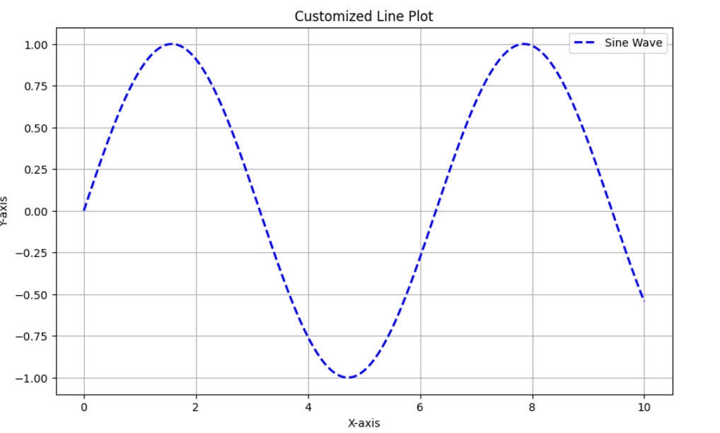
You can increase the clarity of your data presentation and the visual attractiveness of your line plots by personalizing them. This section will cover several ways to adjust line styles, colors, markers, and other elements so you may make customized visualizations that clearly communicate your findings.
Changing Line Styles and Colors
You can enhance the visual appeal of your plot by adjusting the width, color, and line style.
plt.figure(figsize=(10, 6))
plt.plot(x, y, color='blue', linestyle='--', linewidth=2, label='Sine Wave')
plt.title('Customized Line Plot')
plt.xlabel('X-axis')
plt.ylabel('Y-axis')
plt.legend()
plt.grid(True)
plt.show()
Output:
Adding Markers
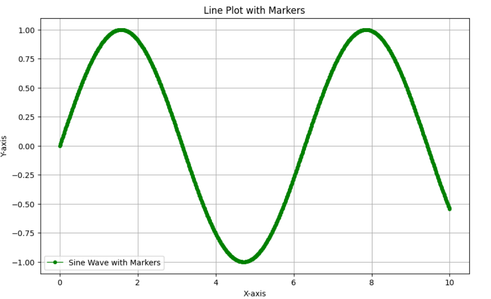
We can add markers to our plot in order to detail and increase clarity of our data.
plt.figure(figsize=(10, 6))
plt.plot(x, y, color='green', linestyle='-', linewidth=1, marker='o', markersize=4, label='Sine Wave with Markers')
plt.title('Line Plot with Markers')
plt.xlabel('X-axis')
plt.ylabel('Y-axis')
plt.legend()
plt.grid(True)
plt.show()
Output:
Multiple Lines
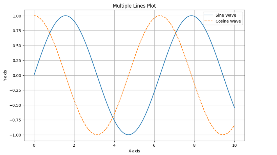
You can plot multiple lines on the same plot to compare different datasets.
# Generate a cosine wave for comparison
y2 = np.cos(x)

plt.figure(figsize=(10, 6))
plt.plot(x, y, label='Sine Wave')
plt.plot(x, y2, label='Cosine Wave', linestyle='--')
plt.title('Multiple Lines Plot')
plt.xlabel('X-axis')
plt.ylabel('Y-axis')
plt.legend()
plt.grid(True)
plt.show()
Output:
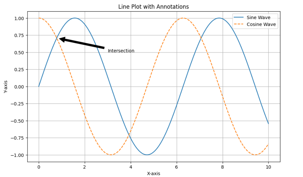
Adding Annotations
Annotations can provide details or draw attention to particular locations.
plt.figure(figsize=(10, 6))
plt.plot(x, y, label='Sine Wave')
plt.plot(x, y2, label='Cosine Wave', linestyle='--')
plt.title('Line Plot with Annotations')
plt.xlabel('X-axis')
plt.ylabel('Y-axis')

# Annotate the point where sine and cosine intersect
plt.annotate('Intersection', xy=(np.pi/4, np.sin(np.pi/4)), xytext=(3, 0.5),
             arrowprops=dict(facecolor='black', shrink=0.05))

plt.legend()
plt.grid(True)
plt.show()
Output:
Saving the Plot
You can save the plot to a file using savefig.
plt.figure(figsize=(10, 6))
plt.plot(x, y, label='Sine Wave')
plt.plot(x, y2, label='Cosine Wave', linestyle='--')
plt.title('Line Plot')
plt.xlabel('X-axis')
plt.ylabel('Y-axis')
plt.legend()
plt.grid(True)
plt.savefig('line_plot.png') # Save the plot as a PNG file
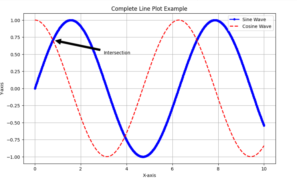
plt.show()Complete Code Example
This is the whole code sample, which covers every customization option that was talked about.
import matplotlib.pyplot as plt
import numpy as np

# Generate sample data
x = np.linspace(0, 10, 1000)
y = np.sin(x)
y2 = np.cos(x)

# Create and customize the plot
plt.figure(figsize=(10, 6))
plt.plot(x, y, color='blue', linestyle='-', linewidth=2, marker='o', markersize=4, label='Sine Wave')
plt.plot(x, y2, color='red', linestyle='--', linewidth=2, label='Cosine Wave')
plt.title('Complete Line Plot Example')
plt.xlabel('X-axis')
plt.ylabel('Y-axis')

# Annotate the point where sine and cosine intersect
plt.annotate('Intersection', xy=(np.pi/4, np.sin(np.pi/4)), xytext=(3, 0.5),
             arrowprops=dict(facecolor='black', shrink=0.05))

plt.legend()
plt.grid(True)
plt.savefig('complete_line_plot.png')
plt.show()
Output:
Conclusion
You may greatly improve your ability to visualize data by learning how to create and modify line plots with Matplotlib. You now know how to configure your system, create and display data, alter charts, compare different datasets, and annotate information effectively. With these abilities, you’ll be able to produce captivating visualizations that clearly convey the data insights you’ve discovered. Thus increasing the impact and comprehension of your investigation.
Don’t miss this chance to improve your skills and advance your career. Learn Python with us! This course is suitable for all levels.
Frequently Asked Questions
Q1. What is Matplotlib used for?
A. Python users may create static, interactive, and animated visualizations using the Matplotlib library. It’s very helpful for creating graphs, charts, and plots.
Q2. Can I customize the appearance of my line plot?
A. Yes, you can customize appearance of line plot by changing line styles, colors, markers, and add annotations to enhance the visual appeal of your plot.
Q3. What are markers in Matplotlib, and why are they useful?
A. Markers are symbols used to highlight individual data points on a line plot. They are useful for emphasizing specific data points, making the plot easier to interpret.
My name is Ayushi Trivedi. I am a B. Tech graduate. I have 3 years of experience working as an educator and content editor. I have worked with various python libraries, like numpy, pandas, seaborn, matplotlib, scikit, imblearn, linear regression and many more. I am also an author. My first book named #turning25 has been published and is available on amazon and flipkart. Here, I am technical content editor at Analytics Vidhya. I feel proud and happy to be AVian. I have a great team to work with. I love building the bridge between the technology and the learner.


