Introduction
Have you ever found yourself staring at a table full of numbers—maybe sales figures, customer demographics, or financial data — and felt completely overwhelmed? You’re not alone! Dealing with and interpreting raw data is never easy, but knowing how to look for essential patterns can be tough, too. However, with better data visualization, all this unstructured information can be turned into clear, actionable insights. Various visualization methods like Heatmaps aid in this process.
Heatmaps are a great practice for visualizing data density and showing trends that would take time to display using other normal charts. In this interactive guide, you will get clarification on making your own heatmaps in Power BI. From utilizing built-in functions to custom visualizations, there’s plenty to cover here.

Overview
- Heatmaps are essential for visualizing data density and trends and transforming raw data into actionable insights.
- Learn to create heatmaps in Power BI using built-in functions like conditional formatting and custom visuals.
- Heatmaps use color gradients to represent data values, aiding in quick pattern and trend identification.
- Power BI’s conditional formatting allows easy heatmap creation by changing cell colors based on values.
- Custom visuals from Microsoft AppSource enable detailed geographical heatmaps in Power BI.
- Effective heatmaps require thoughtful design choices like appropriate color selection and data binning.
Table of contents
What are Heatmaps?
Heatmaps are graphical representations of data where values are depicted using colors. They are handy for visualizing the distribution and intensity of data. In computer vision and data analysis, using a color gradient, heatmaps often display the concentration or magnitude of certain values (such as pixel intensities, frequencies, or statistical measures). Analysts and researchers can quickly grasp data patterns, trends, and outliers. Heatmaps can be applied in various fields, including biology, finance, and geology, and especially in areas like image processing to visualize things like activation regions in neural networks or statistical measures across images.
You can refresh your Power BI learning by reading this – What is Power BI? Architecture, Features and Components
Here are 2 Ways to Create a Heatmap in Power BI
Power BI offers several ways to create heatmaps, catering to different data visualization needs:
- Conditional Formatting: You can apply conditional formatting to tables or matrices to change cell colors based on values, effectively creating a heatmap. This straightforward method allows for quick heatmap creation within a table or matrix visual.
- Custom Visual: Use custom map visuals from the Microsoft AppSource marketplace to create tables, geographical heat maps, etc. This method is particularly useful for visualizing data distribution across different geographical areas.
Tips for Effective Heatmaps
- Color Selection: Choose colors that are distinct and have clear differences to represent different data ranges effectively.
- Data Binning: If your measure values vary widely, consider binning the data into ranges to improve readability.
- Interactivity: Enable tooltips and interactions to allow users to drill down into specific data points for more detailed analysis.
Creating a heatmap in Power BI is a powerful way to interpret complex data sets visually. By using conditional formatting or custom visuals, you can tailor the heatmap to your specific needs and provide valuable insights to your audience.
Conditional Formatting
Step-by-Step Guide to Creating a Heatmap using Conditional Formatting:
Step 1: Open Power BI Desktop

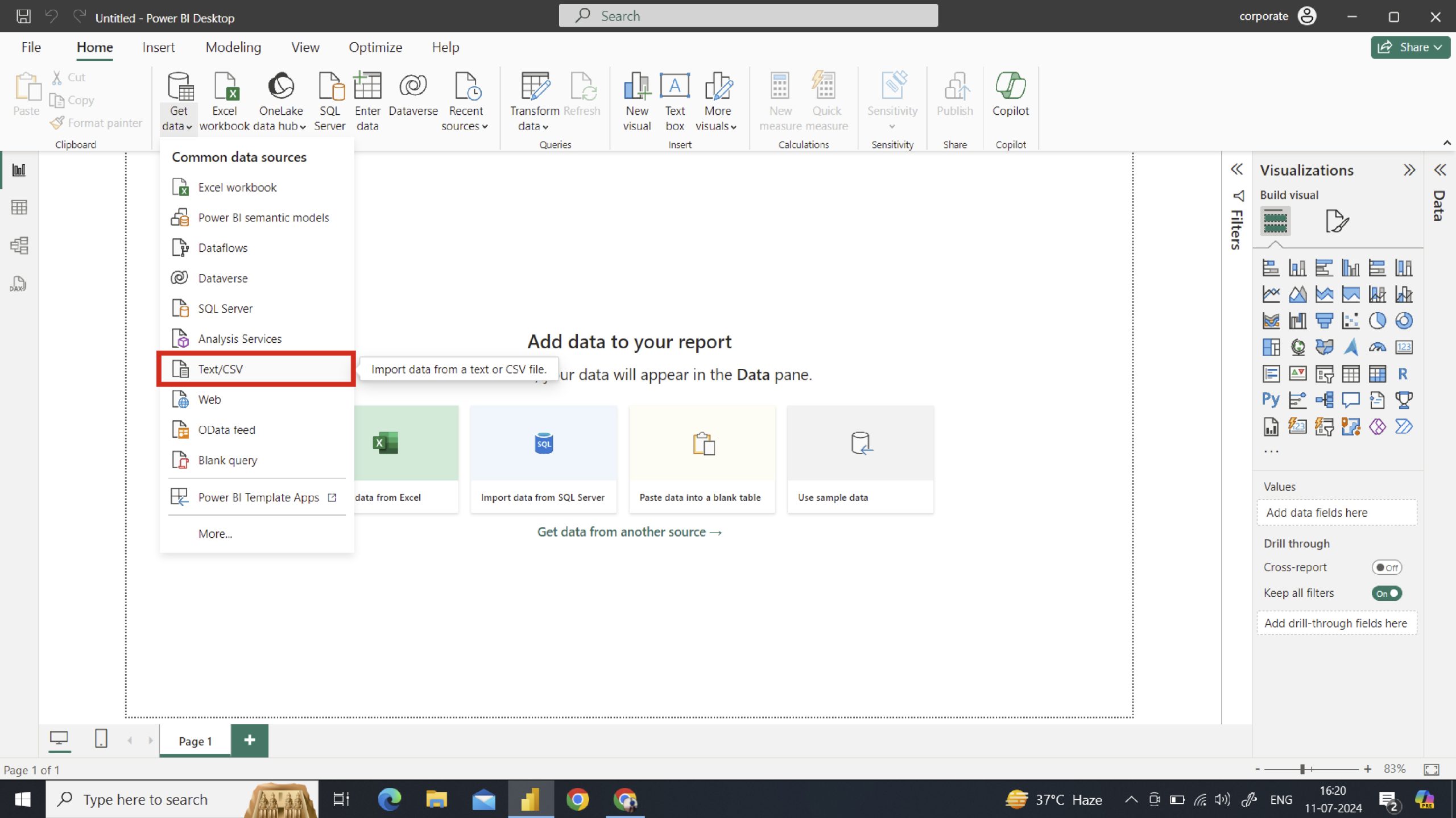
- Open Power BI Desktop and load your dataset by clicking on Get Data and selecting the appropriate data source.
- You can also import it using the Import data option below.
Prepare and Import Your Data
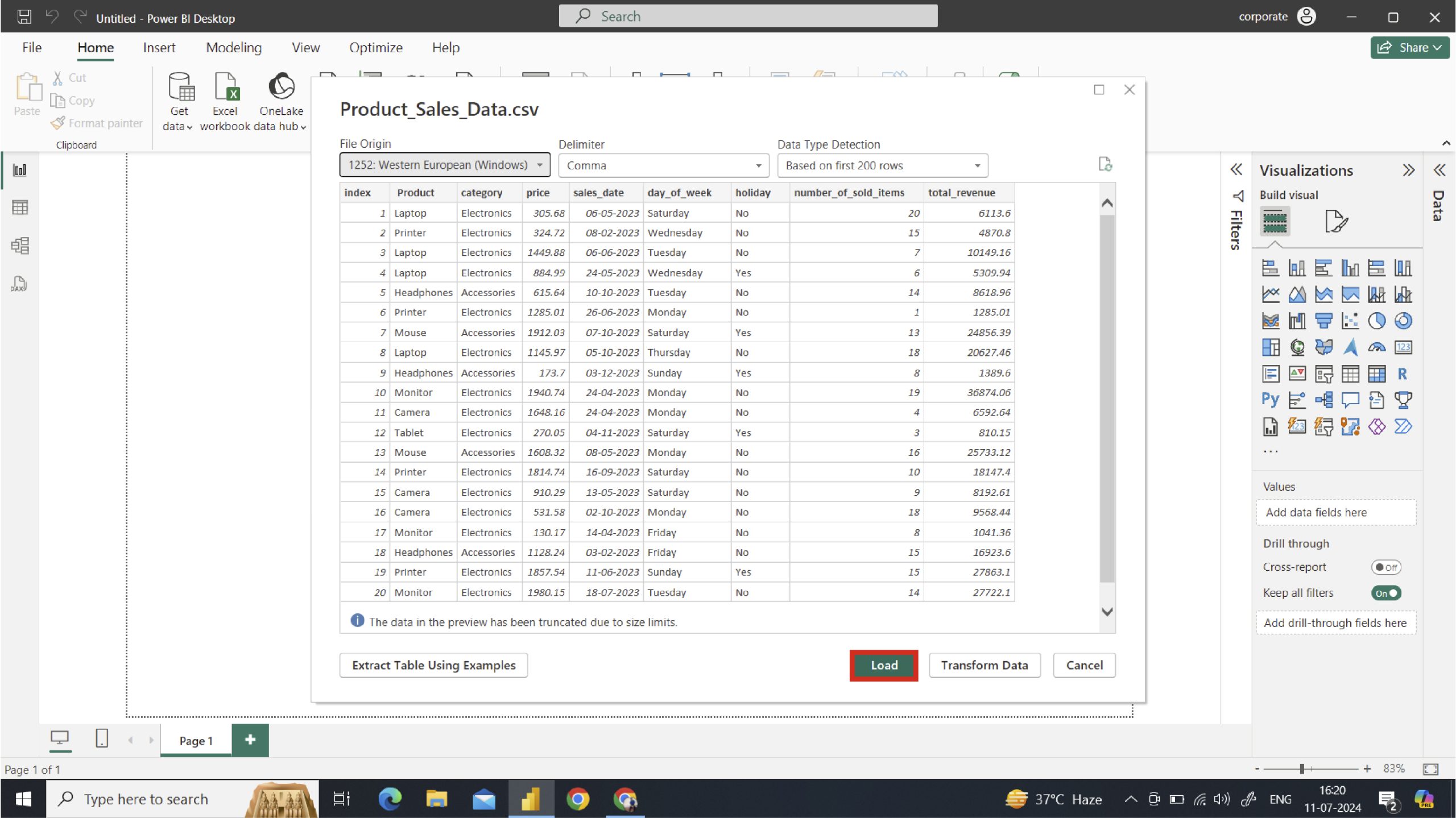
- Ensure your data is well-organized. We have uploaded product sales data, which is given below.
- Click on the Load option to load the data directly, or click on Transform to organize the data and then load it.
Here is the CSV file:
Let’s look at the uploaded table:
Step 2: Insert a Matrix Visual

Go to the Visualizations pane and select the Matrix visual under Build Visual. Drag your fields to the Rows and Columns sections and the Values section, as shown below.
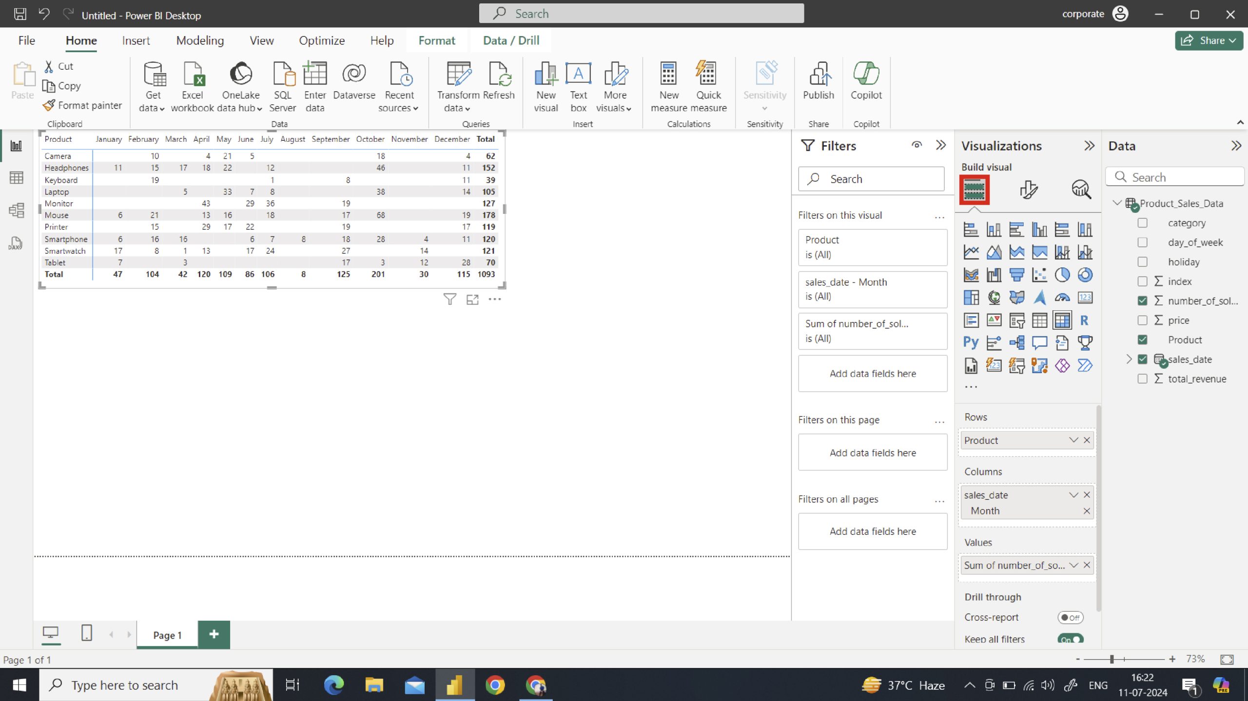
Customize the Data
- In the above example, we used sales_data in the columns. Since Power BI automatically gives a date hierarchy, we must remove Year, Quarter, and Date.
- For the ”Values” field, select the aggregator function, for example, “Sum,” or you can change it to average, count, etc., according to your needs.
You can do all the formatting in this pane, such as changing the background colour, font size, font type, and other basic formatting.
Step 3: Go to the Format Visual
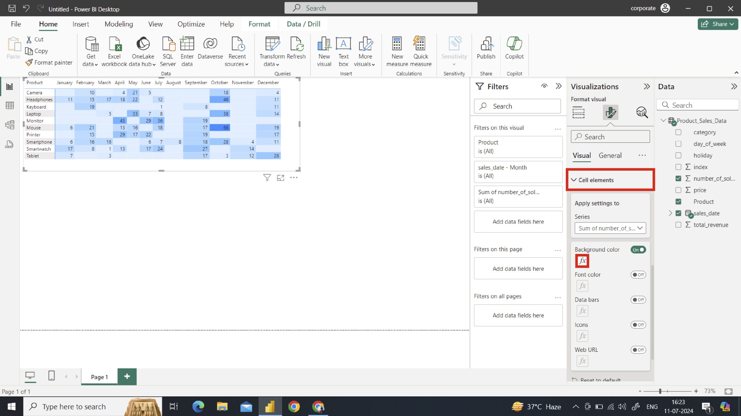
In the same pane, scroll down and expand the “Cell Elements” section. Enable the “Background color” option and click the “fx” button to customize it.
Note: Turn off the Column subtotals and Row subtotals
You have done 95% of your work, and 5% of the remaining is for background and font colors.
Background Color
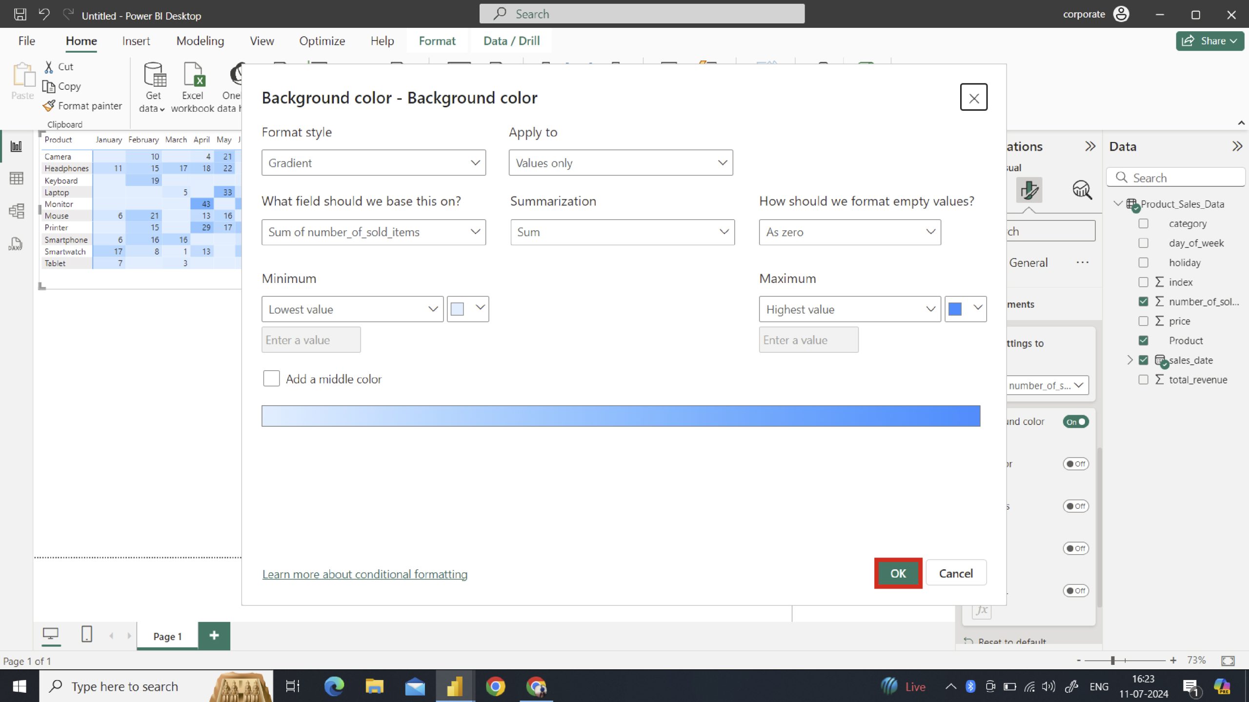
In the background color option, we will format style, decide on a field to base this on, summarize, and other options.
Font Color
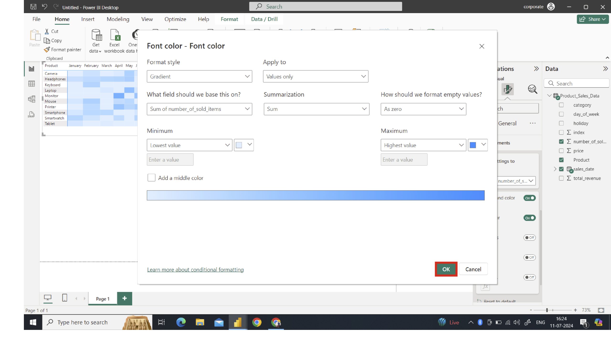
Enable the “Font color” option and click the “fx” button to customize it. We can do the same with the font color, format styling, summarization, and other options.
Note: This will change the text and BG color to the same, but the value is still present, and it will seem like a heatmap.
Custom Visual for Paid Power BI Users
If you have a paid version of Power BI, then opt for this option.
Custom visuals in Power BI offer a range of benefits that enhance data visualization, providing greater flexibility and functionality beyond the default visualizations available.
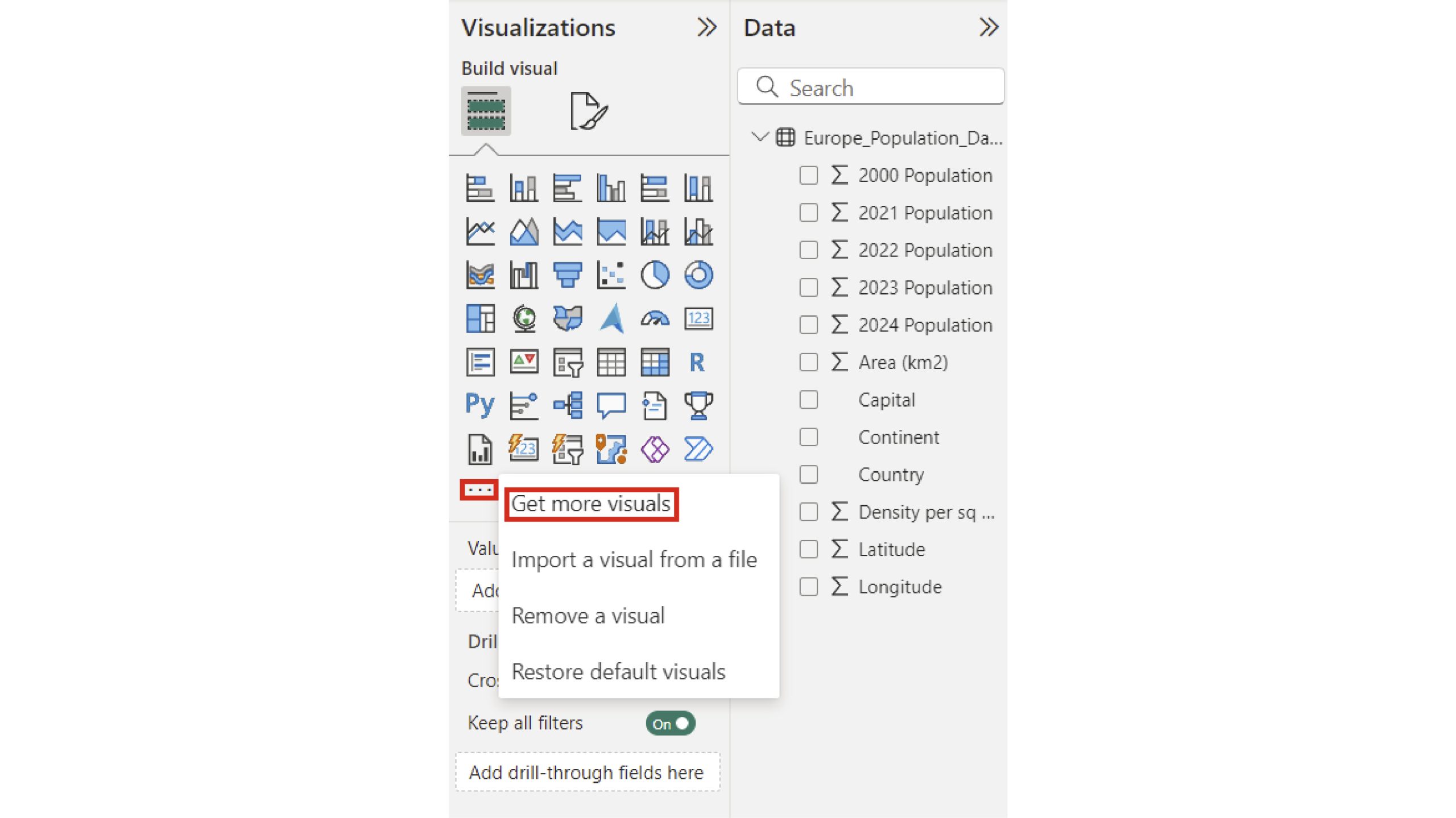
Step 1: Install Custom Visual
Install the custom visual to create the Heatmap in Power BI. To access that, open the Visualizations pane and click on the three dots at the end of the list to get the “Get more visuals” from the menu.
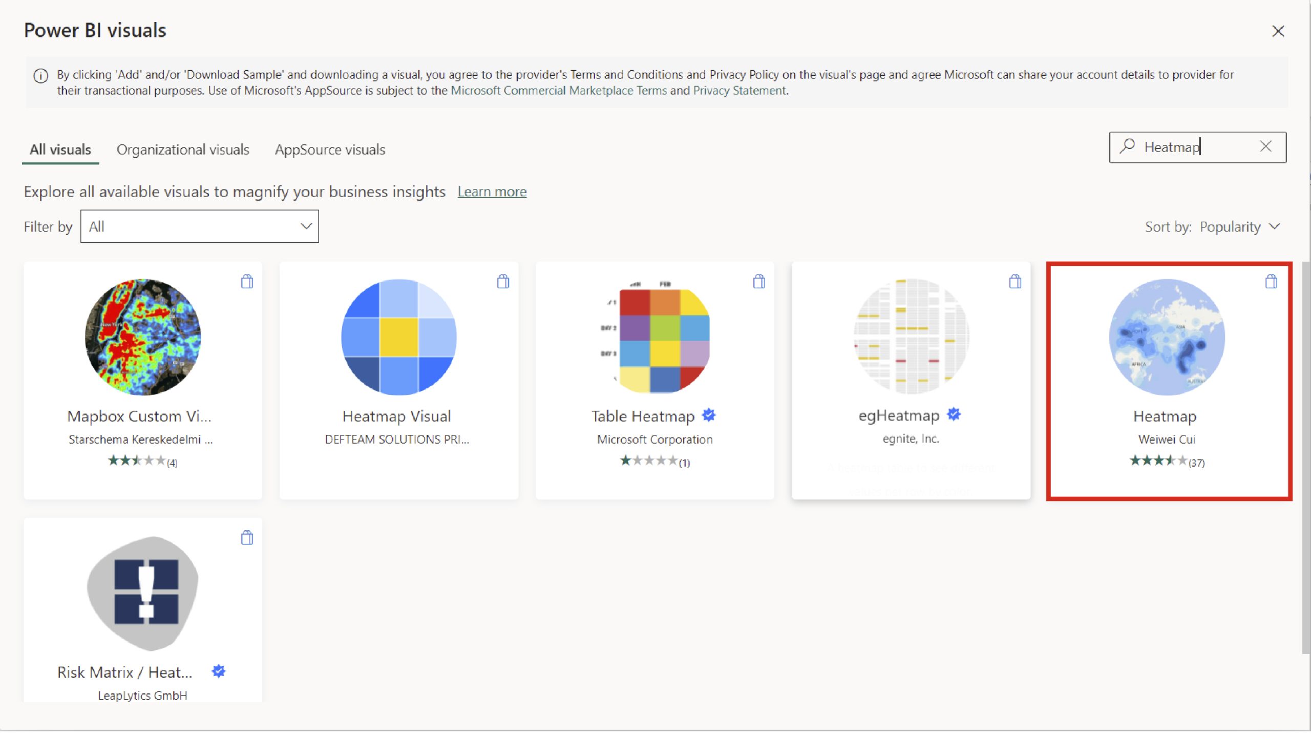
Step 2: Go for the Heatmap
After clicking, you will be taken to the Power BI visuals, where you need to search for Heatmap. Click ‘Add’ the visual you want.
Here’s the overview of Heatmap Visual:
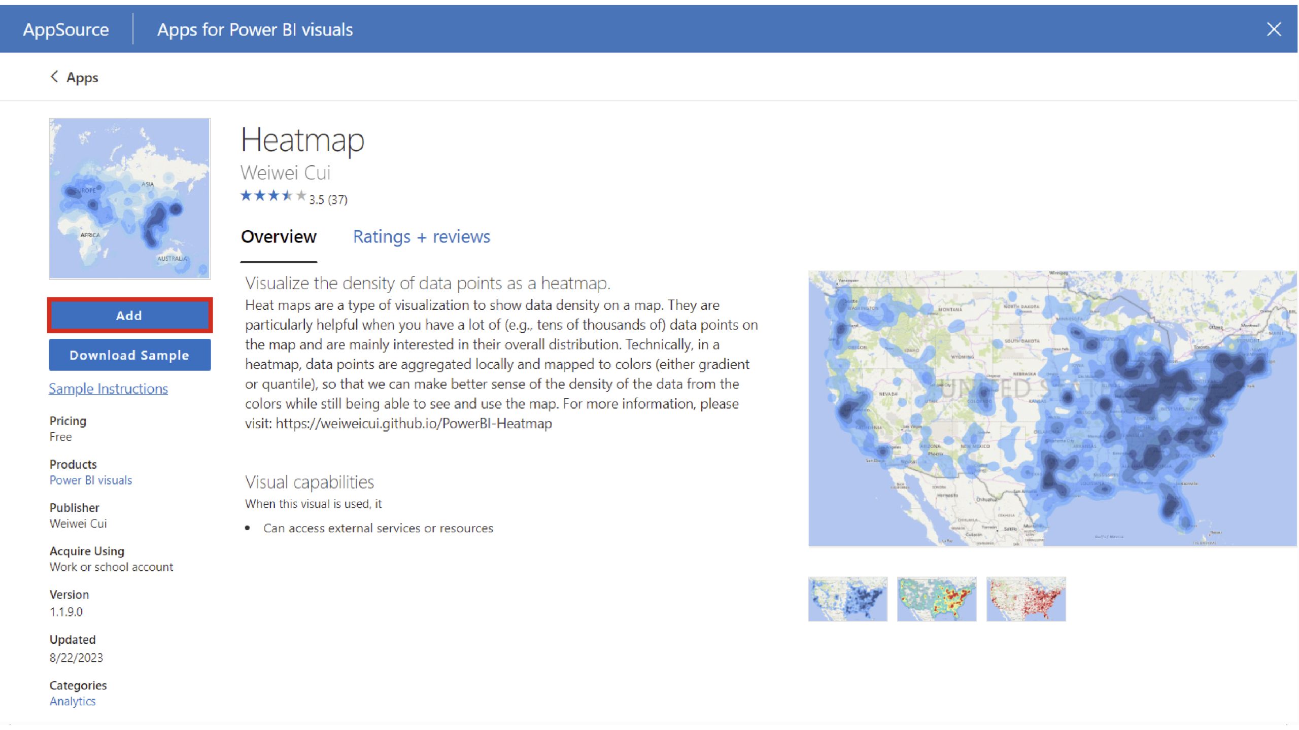
Click on the ADD button
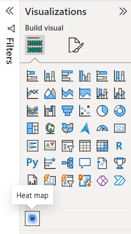
After all this, repeat the above step from importing data to loading it, and then find the heatmap logo.
Here is the CSV file:
- Open the Power BI Report:
- Navigate to your report and locate the Visualizations pane.
- Insert a Heatmap:
- Click on the heatmap icon to add a blank heatmap to your report.
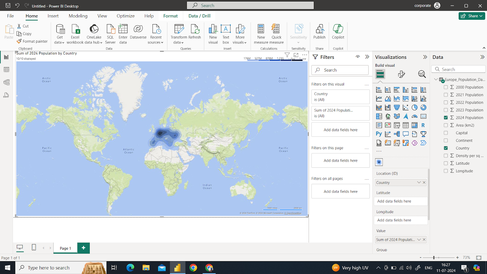
- Add Data to the Heatmap:
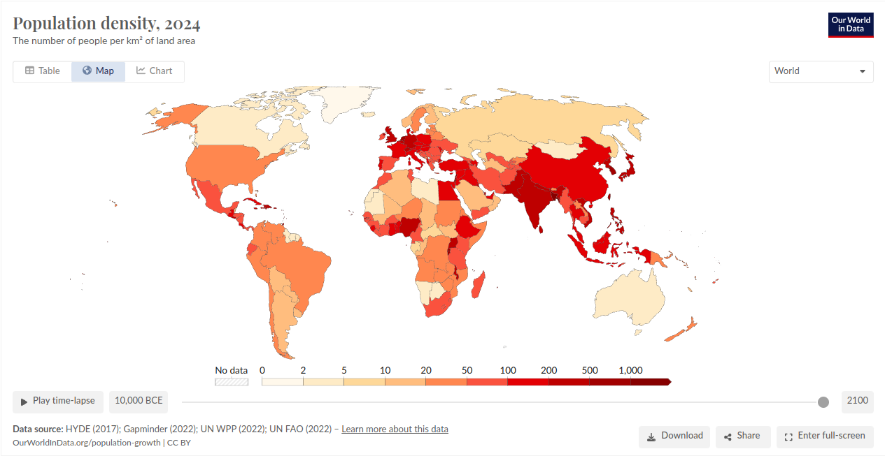
- Location: Drag and drop the column representing the country into the heatmap.
- Value: Drag and drop the column representing the value or metric you want to display (e.g., global population).
Note: If your dataset includes separate columns for longitude and latitude, you can use those to specify the location instead of a single “Location” column.
- View the Heatmap:
- With the location and value fields set, your heatmap will populate and become visible in the report.
Conclusion
Creating heatmaps in Power BI is a powerful method for transforming raw data into visual insights. Heatmaps can help you quickly identify patterns, trends, and outliers, whether you use conditional formatting or custom visuals. Following the step-by-step guide, you can utilize Power BI’s built-in functionalities or leverage custom visuals to create dynamic and interactive heatmaps. This enables more effective data analysis and supports better data-driven decision-making. With thoughtful design choices, such as appropriate color selection and data binning, you can enhance the readability and impact of your heatmaps.
Frequently Asked Questions
Q1. What is a Heatmap in Power BI?
Ans. A heatmap in Power BI is a data visualization technique that uses color coding to represent different values of data points. It helps identify patterns, correlations, and outliers within a dataset by displaying values in a matrix format where varying colors represent individual data points.
Q2. How can I improve the readability of my Power BI Heatmap?
Ans. To improve the readability of your Power BI heatmap:
A. Use a clear and intuitive color scale, avoiding too many colors that confuse the visualization.
B. Add data labels or tooltips to provide more context for each data point.
C. Use appropriate aggregation levels to avoid cluttering the heatmap with too much detail.
D. Utilize filters to allow users to focus on specific subsets of data.
E. Ensure your heatmap has a clear title and axis labels to help users understand what they are looking at.
Q3. What are some common use cases for Heatmaps in Power BI?
Ans. Common use cases for heatmaps in Power BI include:
A. Analyzing sales data across different regions and periods.
B. Identifying patterns in customer behavior or preferences.
C. Monitoring performance metrics across various departments or teams.
D. Visualizing website traffic or user interactions.
E. Spotting trends in financial data, such as revenue or expenses over time.
Hi, I am Pankaj Singh Negi - Senior Content Editor | Passionate about storytelling and crafting compelling narratives that transform ideas into impactful content. I love reading about technology revolutionizing our lifestyle.


