Creating publication-ready figures and tables is essential for academic research and data presentation. Python, with its robust ecosystem of libraries, offers a wide range of tools to help you generate high-quality, aesthetically pleasing, and customizable visuals for your research papers.
In this article, we’ll explore how to use Python to generate publication-ready figures and tables. We’ll cover popular libraries such as Matplotlib, Seaborn, Plotly, and Pandas for creating figures, and how to use Pandas and Matplotlib for formatting tables. We’ll also discuss important design principles and tips for optimizing these elements for publication.

Table of contents
- Overview of the publication-ready Figures and Tables Libraries
- Creating Publication-Ready Figures
- Let’s Create a Figure with Matplotlib
- Advanced Customization with Seaborn
- Creating Interactive Figures with Plotly
- Tables for Publications
- Best Practices for Tables in Publications
- Conclusion
- Frequently Asked Questions
Overview of the publication-ready Figures and Tables Libraries
1. Matplotlib
Matplotlib is one of Python’s most widely used data visualisation libraries. It offers extensive control over every aspect of a figure, from its size and layout to its colors and fonts. Researchers can customize their plots to suit the requirements of their publication, ensuring that the visual elements are consistent and clear.
- Key Features:
- Fine-grained control over plot elements.
- Extensive support for 2D plotting (line, scatter, bar charts, etc.).
- High flexibility for styling plots (titles, labels, axis ticks).
- Can export figures in publication-quality formats (e.g., PDF, PNG, SVG).
2. Seaborn
Seaborn builds on top of Matplotlib and provides a higher-level interface for creating visually attractive and informative statistical graphics. It simplifies the process of creating complex visualizations like heatmaps, violin plots, and regression plots, while also automatically handling aesthetic elements like color palettes and axis labels.
- Key Features:
- Predefined themes and color palettes that are ideal for publication-ready plots.
- High-level functions for statistical plots (e.g., boxplots, pair plots, and categorical plots).
- Seamless integration with Pandas data structures.
3. Plotly
Plotly is an interactive visualization library that excels in creating highly interactive, web-based plots. Although it is most commonly used for dashboards and web apps, Plotly’s export options allow for high-quality, static visualizations suitable for publications. Plotly supports a wide variety of chart types, including scatter plots, choropleth maps, and 3D plots.
- Key Features:
- Interactive visualizations (hover, zoom, and click functionalities).
- Publication-quality static exports (e.g., PNG, SVG, PDF).
- Wide range of chart types (e.g., choropleth maps, network graphs).
- Easy customization of plot elements.
4. Pandas
While Pandas is primarily known for its data manipulation capabilities, it also offers robust functionality for creating simple tables and plots. Pandas integrates seamlessly with Matplotlib and Seaborn, enabling easy conversion of DataFrames into graphical plots and styled tables. You can export Pandas tables to HTML, LaTeX, or Excel formats, which is particularly useful when preparing tables for academic papers.
- Key Features:
- Built-in plotting functions for quick visualizations from DataFrames.
- Ability to format tables for display (e.g., setting column widths, text alignment, and borders).
- Export options for various formats (HTML, LaTeX, Excel).
Creating Publication-Ready Figures
Here are the guidelines and libraries we will use:
Key Libraries
- Matplotlib: A versatile library for static, animated, and interactive plots. It allows fine-grained control over almost every aspect of the figure.
- Seaborn: Built on top of Matplotlib, Seaborn provides a high-level interface for drawing attractive statistical graphics.
- Plotly: For interactive visualizations, though also supports static exports that can be used in publications.
General Guidelines for Figures:
- Resolution: Ensure your figures are saved in a high resolution (at least 300 DPI for print quality).
- Color: Use color palettes that are printer-friendly and suitable for color-blind viewers.
- Legibility: Use large fonts for axis labels, titles, and legends. Figures should be easily readable even at reduced sizes.
- Consistency: Keep styles consistent across all figures in the paper (same font, gridlines, color schemes, etc.).
- Clear Labels: Use meaningful axis labels and legends, ensuring that each figure is self-explanatory.
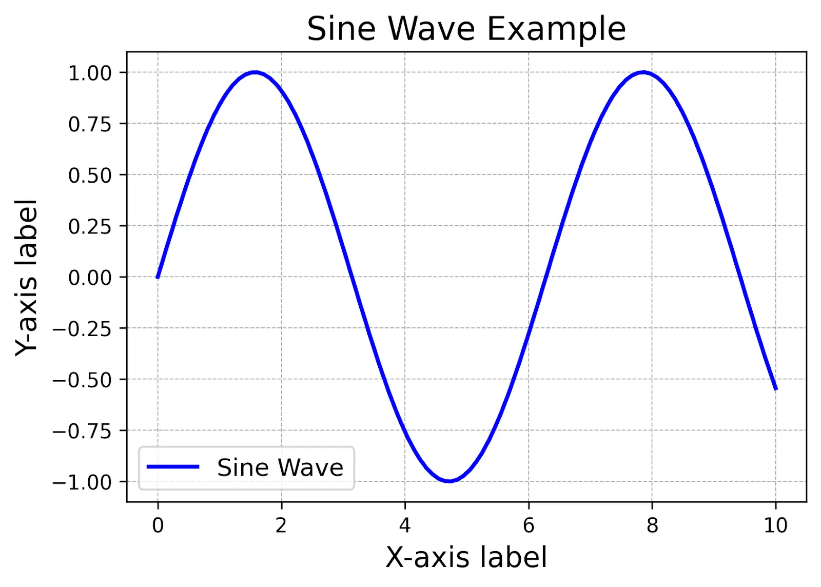
Let’s Create a Figure with Matplotlib
import matplotlib.pyplot as plt

import numpy as np

# Create data

x = np.linspace(0, 10, 100)

y = np.sin(x)

# Create a figure with publication-quality aesthetics

plt.figure(figsize=(6, 4), dpi=300)  # Set figure size and resolution

plt.plot(x, y, label="Sine Wave", color='b', linewidth=2)

# Adding labels and title

plt.xlabel("X-axis label", fontsize=14)

plt.ylabel("Y-axis label", fontsize=14)

plt.title("Sine Wave Example", fontsize=16)

# Adding grid and legend

plt.grid(True, which='both', linestyle='--', linewidth=0.5)

plt.legend(fontsize=12)

# Saving the figure as a high-resolution PNG

plt.savefig("sine_wave_figure.png", dpi=300, bbox_inches="tight")

plt.show()
Output

Explanation
- The figsize parameter sets the figure dimensions (6×4 inches here).
- The dpi=300 ensures the figure is high resolution.
- bbox_inches=’tight’ removes extra whitespace when saving the figure.
Also read: Introduction to Matplotlib using Python for Beginners
Advanced Customization with Seaborn
Seaborn simplifies the creation of complex statistical plots. It integrates with Matplotlib and can quickly generate high-quality plots with attractive default styles.
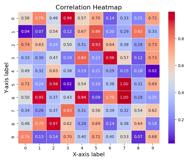
Example: A Publication-Ready Heatmap with Seaborn
import seaborn as sns

import numpy as np

# Create a random correlation matrix

data = np.random.rand(10, 10)

# Create a heatmap with Seaborn

plt.figure(figsize=(8, 6))

sns.heatmap(data, annot=True, cmap="coolwarm", fmt=".2f", linewidths=0.5)

# Adding labels and title

plt.title("Correlation Heatmap", fontsize=16)

plt.xlabel("X-axis label", fontsize=14)

plt.ylabel("Y-axis label", fontsize=14)

# Save figure

plt.savefig("heatmap.png", dpi=300, bbox_inches="tight")

plt.show()
Output

Here, Seaborn handles much of the styling automatically (like the colour map and annotations), allowing you to focus on the data.
Also read: The Ultimate Guide to Pandas For Data Science!
Creating Interactive Figures with Plotly
If your publication allows for interactive components (e.g., supplementary materials), Plotly is a powerful tool. It enables you to generate interactive plots that can be embedded in web pages or exported as static images.
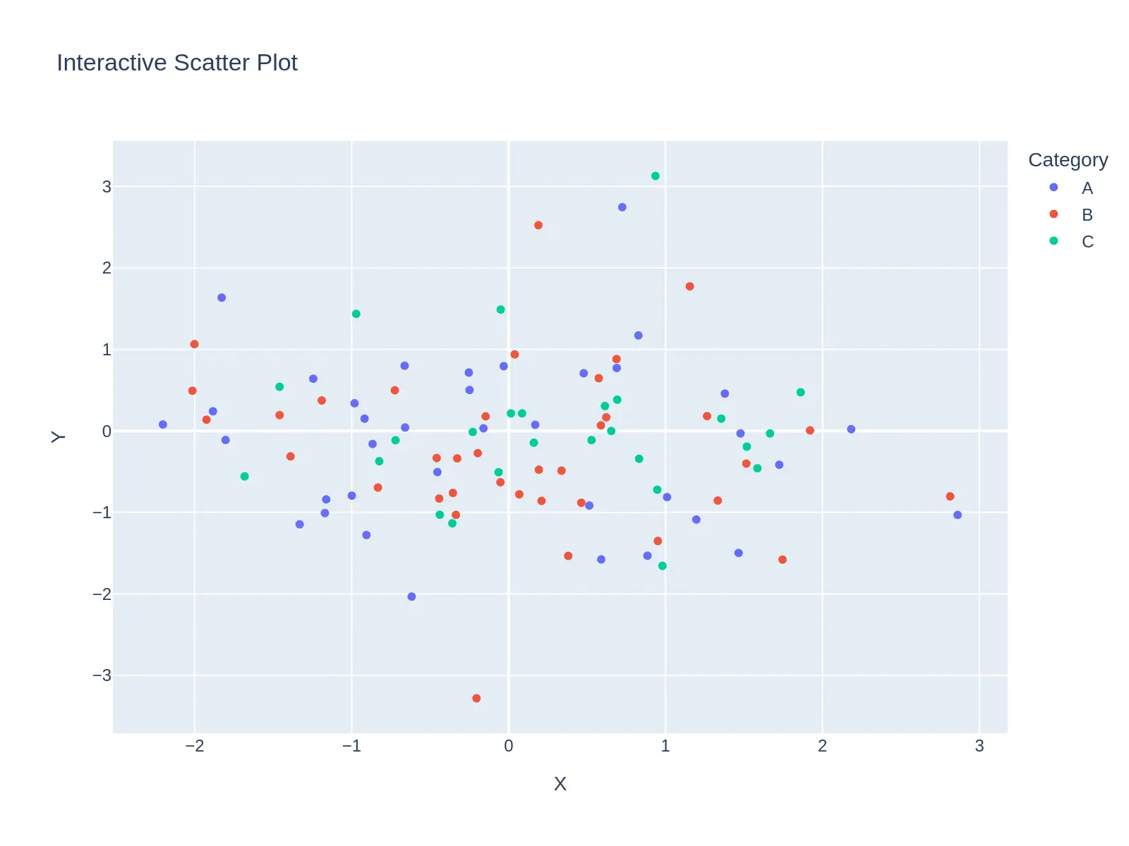
Example: Interactive Scatter Plot with Plotly
!pip install --upgrade kaleido

import plotly.express as px

import pandas as pd

import numpy as np

# Sample data

df = pd.DataFrame({

   "X": np.random.randn(100),

   "Y": np.random.randn(100),

   "Category": np.random.choice(['A', 'B', 'C'], size=100)

})

# Create an interactive scatter plot

fig = px.scatter(df, x="X", y="Y", color="Category", title="Interactive Scatter Plot")

# Save as HTML file (for interactive use) or PNG (for publication)

fig.write_html("scatter_plot.html")

fig.write_image("scatter_plot.png", width=800, height=600, scale=2)
Output

Also read: Guide to Create Interactive Plots with Plotly Python
Tables for Publications
Tables are another crucial part of scientific papers. Python’s Pandas library is widely used for creating and formatting data tables. For publication, tables should be clear, well-organized, and easy to read.
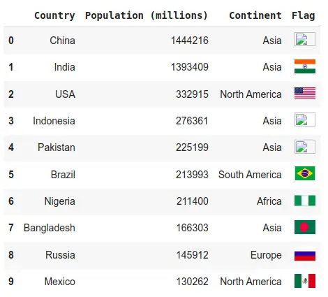
Example: Creating a Table with Pandas
import pandas as pd

import plotly.express as px

from IPython.core.display import HTML

# Create a DataFrame with population, continent, and country flags

data = {

   'Country': ['China', 'India', 'USA', 'Indonesia', 'Pakistan', 'Brazil', 'Nigeria', 'Bangladesh', 'Russia', 'Mexico'],

   'Population (millions)': [1444216, 1393409, 332915, 276361, 225199, 213993, 211400, 166303, 145912, 130262],

   'Continent': ['Asia', 'Asia', 'North America', 'Asia', 'Asia', 'South America', 'Africa', 'Asia', 'Europe', 'North America'],

   'Flag': [

       'https://upload.wikimedia.org/wikipedia/commons/0/0d/Flag_of_China.svg',

       'https://upload.wikimedia.org/wikipedia/commons/4/41/Flag_of_India.svg',

       'https://upload.wikimedia.org/wikipedia/commons/a/a4/Flag_of_the_United_States.svg',

       'https://upload.wikimedia.org/wikipedia/commons/9/9d/Flag_of_Indonesia.svg',

       'https://upload.wikimedia.org/wikipedia/commons/3/3f/Flag_of_Pakistan.svg',

       'https://upload.wikimedia.org/wikipedia/commons/0/05/Flag_of_Brazil.svg',

       'https://upload.wikimedia.org/wikipedia/commons/7/79/Flag_of_Nigeria.svg',

       'https://upload.wikimedia.org/wikipedia/commons/f/f9/Flag_of_Bangladesh.svg',

       'https://upload.wikimedia.org/wikipedia/commons/f/f3/Flag_of_Russia.svg',

       'https://upload.wikimedia.org/wikipedia/commons/f/fc/Flag_of_Mexico.svg'

   ]

}

# Create DataFrame

df = pd.DataFrame(data)

# Manually add flags as HTML img tags (with custom width and height)

df['Flag'] = df['Flag'].apply(lambda x: f'<img src="{x}" width="30" height="20">')

# Display the DataFrame using HTML rendering (to show flags correctly)

html_table = df.to_html(escape=False)  # Escape is False to allow HTML rendering

# Display the table with flags in the notebook

display(HTML(html_table))

# Map visualization using Plotly

fig = px.choropleth(df,

                   locations='Country',

                   locationmode='country names',

                   color='Population (millions)',

                   hover_name='Country',

                   hover_data=["Continent", "Population (millions)"],

                   color_continuous_scale=px.colors.sequential.Plasma,

                   title="Top 10 Countries by Population")

# Optional: To download the HTML table

from google.colab import files

df.to_html("population_table_with_flags.html", escape=False)

files.download("population_table_with_flags.html")
Best Practices for Tables in Publications
- Use Clear Headers: Column headers should be descriptive, and avoid overly technical jargon.
- Consistency: Ensure that all numbers are presented in a consistent format (e.g., decimal places).
- Alignment: Align numbers by decimal points and text by the left.
- Footnotes: Use footnotes for additional explanations instead of cluttering the table.
Conclusion
Python offers a powerful suite of tools for generating publication-ready figures and tables. Whether you’re creating static plots with Matplotlib, statistical plots with Seaborn, or interactive visualizations with Plotly, Python has you covered. For tables, Pandas allows you to easily format and export data in various formats for publication.
Key Takeaways
- Choose appropriate libraries for the task (Matplotlib/Seaborn for static, Plotly for interactive).
- Prioritize clarity and consistency in your designs.
- Export at high resolution (300 DPI) and use readable font sizes.
- For tables, ensure clear headers, consistent formatting, and clean design.
By following these tips and utilizing Python’s extensive libraries, you can create professional-quality figures and tables that will enhance the clarity and impact of your research paper.
Frequently Asked Questions
Ans. Publication-ready figures and tables are graphics and data tables formatted to meet the standards of academic journals and publications. They must be clear, high-quality, and visually appealing while adhering to style guidelines such as font size, resolution, and layout.
Ans. Python offers powerful libraries like Matplotlib, Seaborn, and Plotly to create customizable, high-quality visualizations. These tools allow for precise control over figure design, including color schemes, labels, and axis formatting, making it easier to produce publication-ready figures and tables with Python.
Ans. Yes, Python allows for the creation of high-resolution figures by specifying the DPI (dots per inch) when saving images. Using libraries like Matplotlib, you can export figures in various formats (e.g., PNG, SVG, PDF) while ensuring they meet publication standards.
These FAQs provide a quick overview of how Python can be used to create “Publication-Ready Figures and Tables with Python,” which is essential for researchers and data scientists aiming to publish high-quality, visually appealing research outputs.
Ans. A figure is considered publication-ready when it is visually clear, aesthetically pleasing, and adheres to specific journal guidelines. This includes choosing appropriate color schemes, ensuring high resolution (300 DPI or higher), proper axis labeling, and including legends, titles, and annotations.


