Introducing KitikiPlot, a Python library designed for visualizing sequential and time-series categorical “Sliding Window” patterns. This innovative tool is designed to empower data practitioners across various fields, including genomics, air quality monitoring, and weather forecasting to uncover insights with enhanced clarity and precision. Designed with simplicity and versatility, it integrates seamlessly with Python’s data ecosystem while offering visually appealing outputs for pattern recognition. Let’s explore its potential, and transform the way of analyzing categorical sequences.
Learning Objectives
- Understand the KitikiPlot sliding window visualization technique for sequential and time-series categorical data.
- Explore its parameters to tailor visualizations for specific datasets and applications.
- Apply KitikiPlot across various domains, including genomics, weather analysis, and air quality monitoring.
- Develop proficiency in visualizing complex data patterns using Python and Matplotlib.
- Recognize the significance of visual clarity in categorical data analysis to enhance decision-making processes.
This article was published as a part of the Data Science Blogathon.
Table of contents
KitikiPlot: Simplify Complex Data Visualization
KitikiPlot is a powerful visualization tool designed to simplify complex data analysis, especially for applications like sliding window graphs and dynamic data representation. It offers flexibility, vibrant visualizations, and seamless integration with Python, making it ideal for domains such as genomics, air quality monitoring, and weather forecasting. With its customizable features, KitikiPlot transforms raw data into impactful visuals effortlessly.
- KitikiPlot is a Python library for visualizing sequential and time-series categorical “Sliding Window” data.
- The term ‘kitiki‘(కిటికీ) means ‘window‘ in Telugu.
Key Features
- Sliding Window: The visual representation consists of one or more rectangular bars, each corresponding to data from a specific sliding window.
- Frame: Each bar is divided into several rectangular cells called “Frames.” These frames are arranged side-by-side, each representing a value from the sequential categorical data.
- Customization Options: Users can customize windows extensively, including options for color maps, hatching patterns, and alignments.
- Flexible Labeling: The library allows users to adjust labels, titles, ticks, and legends according to their preferences.
Getting Started: Your First Steps with KitikiPlot
Dive into the world of KitikiPlot with this quick-start guide. From installation to your first visualization, we’ll walk you through every step to make your data shine.
Install KitikiPlot using pip
pip install kitikiplotImport “kitikiplot”
import pandas as pd
from kitikiplot import KitikiPlot
Load the dataframe
Considered the data frame ‘weatherHistory.csv’ from https://www.kaggle.com/datasets/muthuj7/weather-dataset.
df= pd.read_csv( PATH_TO_CSV_FILE )
print("Shape: ", df.shape)
df= df.iloc[45:65, :]
print("Shape: ", df.shape)
df.head(3)
ktk= KitikiPlot( data= df["Summary"].values.tolist() )
ktk.plot( ) 
Understanding KitikiPlot Parameters
To fully leverage the power of KitikiPlot, it’s essential to understand the various parameters that control how your data is visualized. These parameters allow you to customize aspects such as window size, step intervals, and other settings, ensuring your visualizations are tailored to your specific needs. In this section, we’ll break down key parameters like stride and window_length to help you fine-tune your plots for optimal results.
stride : int (optional)
- The number of elements to move the window after each iteration when converting a list to a DataFrame.
- Default is 1.
index= 0
ktk= KitikiPlot( data= df["Summary"].values.tolist(), stride= 2 )
ktk.plot( cell_width= 2, transpose= True )
window_length : int (optional)
- The length of each window when converting a list to a DataFrame.
- Default is 10.
index= 0

ktk= KitikiPlot( data= df["Summary"].values.tolist(), window_length= 5 )

ktk.plot( transpose= True,
          xtick_prefix= "Frame",
          ytick_prefix= "Window",
cell_width= 2 ) 
figsize : tuple (optional)
- The size of the figure (width, height).
- Default is (25, 5).
ktk= KitikiPlot( data= df["Summary"].values.tolist() )
ktk.plot( figsize= (20, 8) )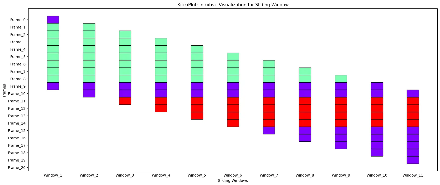
cell_width : float
- The width of each cell in the grid.
- Default is 0.5.
ktk= KitikiPlot( data= df["Summary"].values.tolist() )
ktk.plot( cell_width= 2 )
cell_height : float
- The height of each cell in the grid.
- Default is 2.0.
ktk= KitikiPlot( data= df["Summary"].values.tolist() )
ktk.plot( cell_height= 3 )
transpose : bool (optional)
- A flag indicating whether to transpose the KitikiPlot.
- Default is False.
ktk= KitikiPlot( data= df["Summary"].values.tolist() )
ktk.plot( transpose= False )
ktk= KitikiPlot( data= df["Summary"].values.tolist() )
ktk.plot(
            cell_width= 2,
            transpose= True,
            xtick_prefix= "Frame",
            ytick_prefix= "Window",
            xlabel= "Frames",
            ylabel= "Sliding_Windows" )
window_gap : float
- The gap between cells in the grid.
- Default is 1.0.
ktk= KitikiPlot( data= df["Summary"].values.tolist() )
ktk.plot( window_gap= 3 )
window_range : str or tuple (optional)
- The range of windows to display.
- Use “all” to show all windows or specify a tuple (start_index, end_index).
- Default is “all”.
ktk= KitikiPlot( data= df["Summary"].values.tolist() )
ktk.plot( window_range= "all" )
ktk= KitikiPlot( data= df["Summary"].values.tolist() )
ktk.plot( window_range= (3,8) )
align : bool
- A flag indicating whether to shift consecutive bars vertically (if transpose= False), andhorizontally(if transpose= True) by stride value.
- Default is True.
ktk= KitikiPlot( data= df["Summary"].values.tolist() )
ktk.plot( align= True )
ktk.plot(
         align= False,
         display_yticks= False # Display no yticks
        )
ktk.plot(
         cell_width= 2,
         align= True,
         transpose= True,
         xlabel= "Frames",
         ylabel= "Sliding Windows",
         xtick_prefix= "Frame",
         ytick_prefix= "Window"
        )
ktk.plot(
         cell_width= 2,
         align= False,
         transpose= True,
         xlabel= "Frames",
         ylabel= "Sliding Windows",
         ytick_prefix= "Window",
         display_xticks= False
        )
cmap : str or dict
- If a string, it should be a colormap name to generate colors.
- If a dictionary, it should map unique values to specific colors.
- Default is ‘rainbow’.
ktk= KitikiPlot( data= df["Summary"].values.tolist() )
ktk.plot(
          cmap= "Greens",
          display_legend= True
        )
ktk.plot(
          cmap= {"Mostly Cloudy": "Green"},
          display_legend= True
        )
edge_color : str
- The color to use for the edges of the rectangle.
- Default is ‘#000000’.
ktk.plot(
          cmap= {"Mostly Cloudy": "Green"},
          fallback_color= "wheat",
          edge_color= "blue",
        )
fallback_color : str
- The color to use as fallback if no specific color is assigned.
- Default is ‘#FAFAFA’.
ktk.plot(
          cmap= {"Mostly Cloudy": "Green"},
          fallback_color= "wheat",
          display_legend= True
        )
hmap : dict
- A dictionary mapping unique values to their corresponding hatch patterns.
- Default is ‘{}’.
ktk= KitikiPlot( data= df["Summary"].values.tolist() )
ktk.plot(
          cmap= {"Mostly Cloudy": "grey"},
          fallback_color= "white",
          hmap= {"Mostly Cloudy": "|*|"},
          display_hatch= True
        )
fallback_hatch : str
- The hatch pattern to use as fallback if no specific hatch is assigned.
- Default is ‘” “‘ (string with single space).
ktk= KitikiPlot( data= df["Summary"].values.tolist() )
ktk.plot(
          cmap= {"Mostly Cloudy": "grey"},
          fallback_color= "white",
          hmap= {"Mostly Cloudy": "|*|"},
          fallback_hatch= "\\",
          display_hatch= True
        )
display_hatch : bool
- A flag indicating whether to display hatch patterns on cells.
- Default is False.
ktk= KitikiPlot( data= df["Summary"].values.tolist() )

ktk.plot(
          cmap= {"Mostly Cloudy": "#ffffff"},
          fallback_color= "white",
          display_hatch= True
        )
xlabel : str (optional)
- Label for the x-axis.
- Default is “Sliding Windows”.
ktk= KitikiPlot( data= df["Summary"].values.tolist() )
ktk.plot( xlabel= "Observation Window" )
ylabel : str (optional)
- Label for the y-axis.
- Default is “Frames”.
ktk= KitikiPlot( data= df["Summary"].values.tolist() )
ktk.plot( ylabel= "Frame ID" )
display_xticks : bool (optional)
- A flag indicating whether to display xticks.
- Default is True.
ktk= KitikiPlot( data= df["Summary"].values.tolist() )
ktk.plot( display_xticks= False )
display_yticks : bool (optional)
- A flag indicating whether to display yticks
- Default is True
ktk= KitikiPlot( data= df["Summary"].values.tolist() )
ktk.plot( display_yticks= False )
xtick_prefix : str (optional)
- Prefix for x-axis tick labels.
- Default is “Window”.
ktk= KitikiPlot( data= df["Summary"].values.tolist() )
ktk.plot( xtick_prefix= "Observation" )
ytick_prefix : str (optional)
- Prefix for y-axis tick labels.
- Default is “Frame”.
ktk= KitikiPlot( data= df["Summary"].values.tolist() )
ktk.plot( ytick_prefix= "Time" )
xticks_values : list (optional)
- List containing the values for xticks
- Default is []
ktk= KitikiPlot( data= df["Summary"].values.tolist() )
xtick_values= ['Start', "T1", "T2", "T3", "T4", "T5", "T6", "T7", "T8", "T9", "End"]
ktk.plot( xticks_values= xtick_values )
yticks_values : list (optional)
- List containing the values for yticks
- Default is []
ktk= KitikiPlot( data= df["Summary"].values.tolist() )

yticks_values= [(str(i.hour)+" "+i.strftime("%p").lower()) for i in  pd.to_datetime(df["Formatted Date"])]
ktk.plot( yticks_values= yticks_values )
xticks_rotation : int (optional)
- Rotation angle for x-axis tick labels.
- Default is 0.
ktk= KitikiPlot( data= df["Summary"].values.tolist() )
ktk.plot( xticks_rotation= 45 )
yticks_rotation : int (optional)
- Rotation angle for y-axis tick labels.
- Default is 0.
ktk= KitikiPlot( data= df["Summary"].values.tolist() )

ktk.plot( figsize= (20, 8),     # Increase height of the plot for good visualization (here)
          yticks_rotation= 45
        )
title : str (optional)
- The title of the plot.
- Default is “KitikiPlot: Intuitive Visualization for Sliding Window”.
ktk= KitikiPlot( data= df["Summary"].values.tolist() )
ktk.plot( title= "KitikiPlot for Weather Dataset")
display_grid : bool (optional)
- A flag indicating whether to display grid on the plot.
- Default is False.
ktk= KitikiPlot( data= df["Summary"].values.tolist()[:15] )
ktk.plot( display_grid= True )
ktk= KitikiPlot( data= df["Summary"].values.tolist()[:15] )

ktk.plot(
          cell_width= 2,
          transpose= True,
          xlabel= "Frames",
          ylabel= "Sliding Windows",
          ytick_prefix= "Window",
          display_xticks= False,
          display_grid= True
        )
display_legend : bool (optional)
- A flag indicating whether to display a legend on the plot.
- Default is False.
ktk= KitikiPlot( data= df["Summary"].values.tolist() )
ktk.plot( display_legend= True )
legend_hatch : bool (optional)
- A flag indicating whether to include hatch patterns in the legend.
- Default is False.
ktk= KitikiPlot( data= df["Summary"].values.tolist() )

ktk.plot(
          cmap= {"Mostly Cloudy": "#ffffff"},
          fallback_color= "white",
          display_hatch= True,
          display_legend= True,
          legend_hatch= True
        )
legend_kwargs : dict (optional)
- Additional keyword arguments passed to customize the legend.
- Default is {}.
Place legend outside of the Plot
ktk= KitikiPlot( data= df["Summary"].values.tolist()[:15] )

ktk.plot(
        figsize= (15, 5),
        display_legend= True,
        legend_kwargs= {"bbox_to_anchor": (1, 1.0), "loc":"upper left"} )
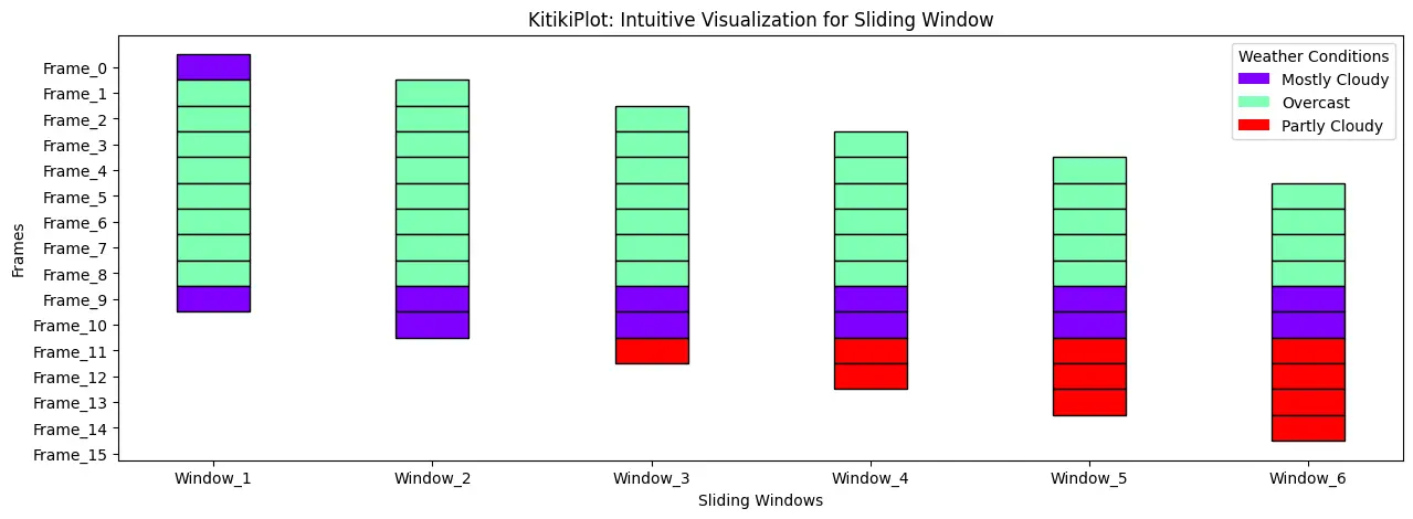
Set title for the legend————————————
ktk= KitikiPlot( data= df["Summary"].values.tolist()[:15] )

ktk.plot(
          figsize= (15, 5),
          display_legend= True,
          legend_kwargs= {"title": "Weather Conditions"}
        )
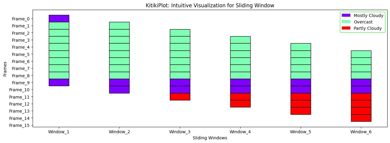
Change edgecolor of the legend
ktk= KitikiPlot( data= df["Summary"].values.tolist()[:15] )

ktk.plot(
          figsize= (15, 5),
          display_legend= True,
          legend_kwargs= {"edgecolor": "lime"}
        )
kitiki_cell_kwargs : dict (optional)
- Additional keyword arguments passed to customize individual cells.
- Default is {}.
Set the line style
ktk= KitikiPlot( data= df["Summary"].values.tolist()[:15] )

ktk.plot(
        figsize= (15, 5),
        kitiki_cell_kwargs= {"linestyle": "--"} )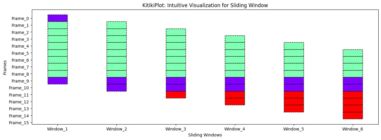
Adjust the line width
ktk= KitikiPlot( data= df["Summary"].values.tolist()[:15] )

ktk.plot(
        figsize= (15, 5),
        kitiki_cell_kwargs= {"linewidth": 3} )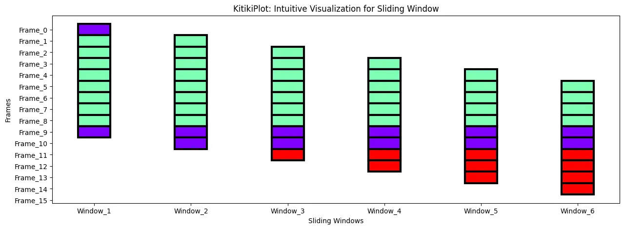
Adjust the alpha
ktk= KitikiPlot( data= df["Summary"].values.tolist()[:15] )

ktk.plot(
        figsize= (15, 5),
        kitiki_cell_kwargs= {"alpha": 0.4} )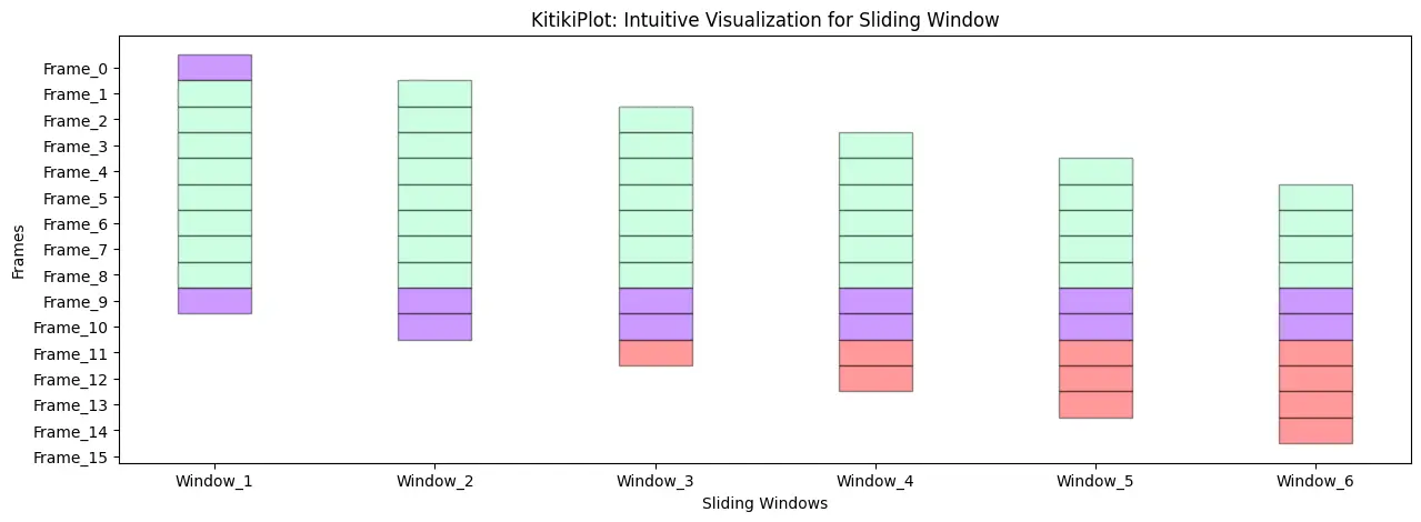
Real-World Applications of KitikiPlot
KitikiPlot excels in diverse fields where data visualization is key to understanding complex patterns and trends. From genomics and environmental monitoring to finance and predictive modeling, KitikiPlot empowers users to transform raw data into clear, actionable insights. Whether you’re analyzing large datasets, tracking air quality over time, or visualizing trends in stock prices, KitikiPlot offers the flexibility and customization needed to meet the unique demands of various industries.
Genomics
- KitikiPlot enables clear visualization of gene sequences, helping researchers identify patterns and motifs.
- It facilitates the analysis of structural variations in genomes, essential for understanding genetic disorders.
- By providing visual representations, it aids in interpreting complex genomic data, supporting advancements in personalized medicine.
Dataset URL: https://archive.ics.uci.edu/dataset/69/molecular+biology+splice+junction+gene+sequences
# Import necessary libraries
from kitikiplot import KitikiPlot
import pandas as pd

# Load the dataset
df= pd.read_csv( "datasets/molecular+biology+splice+junction+gene+sequences/splice.data", header= None )

# Rename the columns
df.columns= ["Label", "Instance_Name", "Nucleotide_Sequence"]

# Select 3 gene sequences randomly
df= df.sample(3, random_state= 1)

# Remove the white spaces from the "Nucleotide_Sequence"
df["Nucleotide_Sequence"]= df["Nucleotide_Sequence"].str.strip()

df
index= 0

ktk= KitikiPlot( data= [i for i in df.iloc[index, 2]], stride= 1, window_length= len(df.iloc[index, 2]) )

ktk.plot(
        figsize= (20, 0.5),
        cell_width= 2,
        cmap= {'A': '#007FFF', 'T': "#fffc00", "G": "#00ff00", "C": "#960018"},
        transpose= True,
        xlabel= "Nucleotides",
        ylabel= "Sequence",
        display_yticks= False,
        xtick_prefix= "Nucleotide",
        xticks_rotation= 90,
        title= "Genome Visualization: "+df.iloc[index, 1].strip()+", Label : "+df.iloc[index,0].strip(),
        display_legend= True,
        legend_kwargs= {"bbox_to_anchor": (1.01, 1), "loc":'upper left', "borderaxespad": 0.})
Weather Forecasting
- The library can effectively represent temporal weather data, such as temperature and humidity, over sequential time windows to identify trends.
- This visualization aids in detecting patterns and fluctuations in weather conditions, enhancing the accuracy of forecasts.
- Additionally, it supports the analysis of historical data, allowing for better predictions and informed decision-making regarding weather-related activities.
Dataset URL: https://www.kaggle.com/datasets/muthuj7/weather-dataset
# Import necessary libraries
from kitikiplot import KitikiPlot
import pandas as pd

# Read csv
df= pd.read_csv( "datasets/weatherHistory/weatherHistory.csv")
print("Shape: ", df.shape)

# Select a subset of data for visualization
df= df.iloc[45:65, :]
print("Shape: ", df.shape)

df.head(3)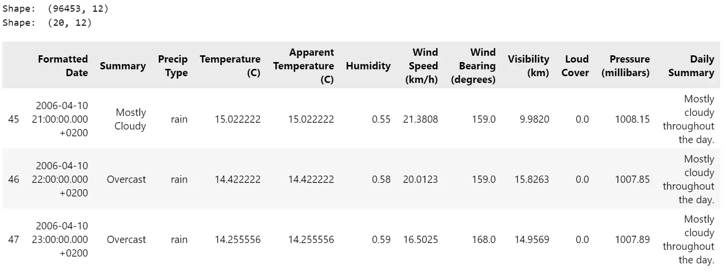
index= 0

weather_data= ['Mostly Cloudy', 'Overcast', 'Overcast', 'Overcast', 'Overcast', 'Overcast','Overcast', 'Overcast',
               'Overcast', 'Mostly Cloudy', 'Mostly Cloudy', 'Partly Cloudy', 'Partly Cloudy', 'Partly Cloudy',
               'Partly Cloudy', 'Mostly Cloudy', 'Mostly Cloudy', 'Mostly Cloudy', 'Mostly Cloudy', 'Mostly Cloudy']
time_period= ['21 pm', '22 pm', '23 pm', '0 am', '1 am', '2 am', '3 am', '4 am', '5 am', '6 am', '7 am', '8 am',
              '9 am', '10 am', '11 am', '12 pm', '13 pm', '14 pm', '15 pm', '16 pm']
ktk= KitikiPlot( data= weather_data, stride= 1, window_length= 10 )
ktk.plot(
        figsize= (20, 5),
        cell_width= 2,
        transpose= False,
        xlabel= "Window",
        ylabel= "Time",
        yticks_values= time_period,
        xticks_rotation= 90,
        cmap= {"Mostly Cloudy": "brown", "Partly Cloudy": "#a9cbe0","Overcast": "#fdbf6f"},
        legend_kwargs= {"bbox_to_anchor": (1.01, 1), "loc":'upper left', "borderaxespad": 0.},
        display_legend= True,
        title= "Weather Pattern on 10-04-2006")
Air Quality Monitoring
- Users can analyze pollutant levels over time with KitikiPlot to detect variations and correlations in environmental data.
- This capability allows for the identification of trends in air quality, facilitating a deeper understanding of how different pollutants interact and fluctuate due to various factors.
- Additionally, it supports the exploration of temporal relationships between air quality indices and specific pollutants, enhancing the effectiveness of air quality monitoring efforts.
Dataset URL: https://archive.ics.uci.edu/dataset/360/air+quality
from kitikiplot import KitikiPlot
import pandas as pd

# Read excel
df= pd.read_excel( "datasets/air+quality/AirQualityUCI.xlsx" )

# Extract data from one day (2004-11-01)
df= df[ df['Date']== "2004-11-01" ]
print("Shape : ", df.shape)
df.head( 3 )

# Convert float to int
df["CO(GT)"]= df["CO(GT)"].astype(int)
CO_values= [3, 3, 3, 3, -200, 2, 1, 1, 1, 1, 2, 3, 4, 4, 3, 3, 3, 2]
time_period= ['0 am', '1 am', '2 am', '3 am', '4 am', '5 am', '6 am', '7 am', '8 am', '9 am', '10 am',
              '11 am', '12 pm', '13 pm', '14 pm', '15 pm', '16 pm', '17 pm']
ktk= KitikiPlot( data= CO_values )
ktk.plot(
        figsize= (20, 5),
        cell_width= 2,
        cmap= {-200: "cornflowerblue", 1: "#ffeaea", 2: "#feb9b9", 3: "#ff7070", 4: "#b00"},
        transpose= True,
        xlabel= "Time",
        ylabel= "Sliding Windows of CO(GT) values (in mg/m^3)",
        display_xticks= True,
        xticks_values= time_period,
        ytick_prefix= "Window",
        xticks_rotation= 90,
        display_legend= True,
        title= "CO(GT) Trend in Air",
        legend_kwargs= {"bbox_to_anchor": (1.01, 1), "loc":'upper left', "borderaxespad": 0.})
Conclusion
KitikiPlot simplifies the visualization of sequential and time-series categorical sliding window data, making complex patterns more interpretable. Its versatility spans various applications, including genomics, weather analysis, and air quality monitoring, highlighting its broad utility in both research and industry. With a focus on clarity and usability, KitikiPlot enhances the extraction of actionable insights from categorical data. As an open-source library, it empowers data scientists and researchers to effectively tackle diverse challenges.
Key Takeaways
- KitikiPlot is a versatile Python library designed for precise and user-friendly sliding window data visualizations.
- Its customizable parameters allow users to create meaningful and interpretable visualizations tailored to their datasets.
- The library supports a wide range of real-world applications across various research and industry domains.
- As an open-source tool, KitikiPlot ensures accessibility for data science practitioners and researchers alike.
- Clear and insightful visualizations facilitate the identification of trends in sequential categorical data.
Resources
Citation
@software{ KitikiPlot_2024
author = {Boddu Sri Pavan and Boddu Swathi Sree},
title = {{KitikiPlot: A Python library to visualize categorical sliding window data}},
year = {2024},
version = {0.1.2},
url = {\url{https://github.com/BodduSriPavan-111/kitikiplot},
doi = {10.5281/zenodo.14293030}
howpublished = {\url{https://github.com/BodduSriPavan-111/kitikiplot}}
}
Frequently Asked Questions
A. KitikiPlot specializes in visualizing sequential and time-series categorical data using a sliding window approach.
A. While primarily intended for categorical data, KitikiPlot can be adapted for other data types through creative preprocessing techniques, such as discretization, etc,.
A. Yes, KitikiPlot integrates seamlessly with popular libraries like Pandas and Matplotlib for effective preprocessing and enhanced visualization.
The media shown in this article is not owned by Analytics Vidhya and is used at the Author’s discretion.


