Python has become the lingua franca for scientific computing and data visualization, thanks in large part to its rich ecosystem of libraries. One such tool that has been a favourite among researchers and practitioners alike is PyLab. In this article, we will delve into the world of PyLab, exploring its origins, features, practical use cases, and why it remains an attractive option for those working in data science. By the end of this guide, you will have a deep understanding of PyLab’s capabilities, along with hands-on code examples that illustrate its power and ease of use.
In data science, the ability to rapidly prototype, analyze, and visualize data is paramount. Python’s ecosystem offers a variety of libraries that simplify these tasks. It is one such library that combines the capabilities of Matplotlib and NumPy into a single namespace, allowing users to perform numerical operations and create compelling visualizations seamlessly.
This article is structured to provide both theoretical insights and practical examples. Whether you are a seasoned data scientist or a beginner eager to explore data visualization, the comprehensive coverage below will help you understand the benefits and limitations of using PyLab in your projects.
Learning Objectives
- Understand PyLab – Learn what PyLab is and how it integrates Matplotlib and NumPy.
- Explore Key Features – Identify PyLab’s unified namespace, interactive tools, and plotting capabilities.
- Apply Data Visualization – Use PyLab to create various plots for scientific and exploratory analysis.
- Evaluate Strengths and Weaknesses – Analyze PyLab’s benefits and limitations in data science projects.
- Compare Alternatives – Differentiate PyLab from other visualization tools like Matplotlib, Seaborn, and Plotly.
This article was published as a part of the Data Science Blogathon.
Table of contents
What is PyLab?
PyLab is a module within the Matplotlib library that offers a convenient MATLAB-like interface for plotting and numerical computation. Essentially, it merges functions from both Matplotlib (for plotting) and NumPy (for numerical operations) into one namespace. This integration enables users to write concise code for both computing and visualization without having to import multiple modules separately.
The Dual Nature of PyLab
- Visualization: PyLab includes a variety of plotting functions such as plot(), scatter(), hist(), and many more. These functions allow you to create high-quality static, animated, and interactive visualizations.
- Numerical Computing: With integrated support from NumPy, PyLab offers efficient numerical operations on large arrays and matrices. Functions such as linspace(), sin(), cos(), and other mathematical operations are readily available.
A Simple Example of PyLab
Consider the following code snippet that demonstrates the power of PyLab for creating a simple sine wave plot:
# Importing all functions from PyLab
from pylab import *

# Generate an array of 100 equally spaced values between 0 and 2*pi
t = linspace(0, 2 * pi, 100)

# Compute the sine of each value in the array
s = sin(t)

# Create a plot with time on the x-axis and amplitude on the y-axis
plot(t, s, label='Sine Wave')

# Add title and labels
title('Sine Wave Visualization')
xlabel('Time (radians)')
ylabel('Amplitude')
legend()

# Display the plot
show()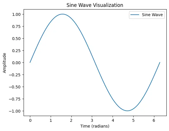
In this example, functions like linspace, sin, and plot are all available under the PyLab namespace, making the code both concise and intuitive.
Key Features of PyLab
PyLab’s integration of numerical and graphical libraries offers several noteworthy features:
1. Unified Namespace
One of PyLab’s primary features is its ability to bring together numerous functions into a single namespace. This reduces the need to switch contexts between different libraries. For example, instead of writing:
# Importing Libraries Explicitly
import numpy as np
import matplotlib.pyplot as plt

t = np.linspace(0, 2*np.pi, 100)
s = np.sin(t)
plt.plot(t, s)
plt.show()
You can simply write:
from pylab import *

t = linspace(0, 2*pi, 100)
s = sin(t)
plot(t, s)
show()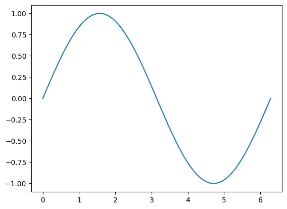
This unified approach makes the code easier to read and write, particularly for quick experiments or interactive analysis.
2. Interactive Environment
PyLab is highly effective in interactive environments such as IPython or Jupyter Notebooks. Its interactive plotting capabilities allow users to visualize data quickly and adjust plots in real-time. This interactivity is crucial for exploratory data analysis where rapid feedback loops can drive deeper insights.
3. MATLAB-like Syntax
For users transitioning from MATLAB, PyLab’s syntax is familiar and easy to adopt. Functions like plot(), xlabel(), and title() work similarly to their MATLAB counterparts, easing the learning curve for new Python users.
For example below is the MATLAB code to plot a sine wave :
% Generate an array of 100 values between 0 and 2*pi
x = linspace(0, 2*pi, 100);

% Compute the sine of each value
y = sin(x);

% Create a plot with a red solid line of width 2
plot(x, y, 'r-', 'LineWidth', 2);

% Add title and axis labels
title('Sine Wave');
xlabel('Angle (radians)');
ylabel('Sine Value');

% Enable grid on the plot
grid on;
While this is the PyLab Python code to plot the same :
from pylab import *

# Generate an array of 100 values between 0 and 2*pi
x = linspace(0, 2*pi, 100)

# Compute the sine of each value
y = sin(x)

# Create a plot with a red solid line of width 2
plot(x, y, 'r-', linewidth=2)

# Add title and axis labels
title('Sine Wave')
xlabel('Angle (radians)')
ylabel('Sine Value')

# Enable grid on the plot
grid(True)

# Display the plot
show()
4. Comprehensive Plotting Options
PyLab supports a variety of plot types including:
- Line Plots: Ideal for time-series data.
- Scatter Plots: Useful for visualizing relationships between variables.
- Histograms: Essential for understanding data distributions.
- Bar Charts: Perfect for categorical data visualization.
- 3D Plots: For more complex data visualization tasks.
5. Ease of Customization
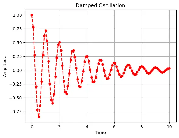
PyLab provides extensive customization options. You can modify plot aesthetics such as colors, line styles, markers, and fonts while using simple commands. For example:
# Import
from pylab import *

# Sample data
x = linspace(0, 10, 100)
y = exp(-x / 3) * cos(2 * pi * x)

# Create a plot with custom styles
plot(x, y, 'r--', linewidth=2, marker='o', markersize=5)
title('Damped Oscillation')
xlabel('Time')
ylabel('Amplitude')
grid(True)
show()
6. Integration with Scientific Libraries
Due to its foundation on NumPy and Matplotlib, PyLab integrates smoothly with other scientific libraries such as SciPy and Pandas. This allows for more advanced statistical analysis and data manipulation alongside visualization.
# Import Libraries
import pandas as pd
from scipy.optimize import curve_fit
from pylab import *

# Define the model function (an exponential decay model)
def model_func(x, A, B):
    return A * exp(-B * x)

# Generate synthetic data
x_data = linspace(0, 4, 50)
true_params = [2.5, 1.3]
y_clean = model_func(x_data, *true_params)
noise = 0.2 * normal(size=x_data.size)
y_data = y_clean + noise

# Create a Pandas DataFrame for the data
df = pd.DataFrame({'x': x_data, 'y': y_data})
print("Data Preview:")
print(df.head())

# Use SciPy's curve_fit to estimate the parameters A and B
popt, pcov = curve_fit(model_func, df['x'], df['y'])
print("\nFitted Parameters:")
print("A =", popt[0], "B =", popt[1])

# Generate predictions from the fitted model
x_fit = linspace(0, 4, 100)
y_fit = model_func(x_fit, *popt)

# Plot the original data and the fitted curve using PyLab
figure(figsize=(8, 4))
scatter(df['x'], df['y'], label='Data', color='blue')
plot(x_fit, y_fit, 'r-', label='Fitted Curve', linewidth=2)
title('Curve Fitting Example: Exponential Decay')
xlabel('X')
ylabel('Y')
legend()
grid(True)
show()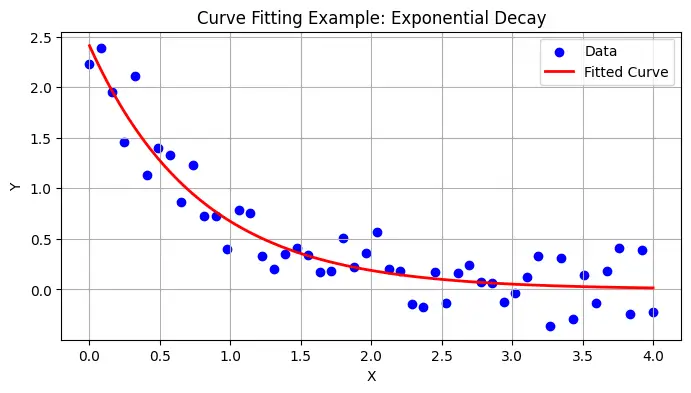
Use Cases of PyLab
PyLab’s versatility makes it applicable across a wide range of scientific and engineering domains. Below are some common use cases where PyLab excels.
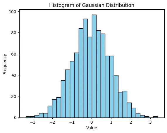
1. Data Visualization in Exploratory Data Analysis (EDA)
When performing EDA, it is crucial to visualize data to identify trends, outliers, and patterns. PyLab’s concise syntax and interactive plotting capabilities make it a perfect tool for this purpose.
Example: Visualizing a Gaussian Distribution
from pylab import *

# Generate random data following a Gaussian distribution
data = randn(1000)

# Plot a histogram of the data
hist(data, bins=30, color='skyblue', edgecolor='black')
title('Histogram of Gaussian Distribution')
xlabel('Value')
ylabel('Frequency')
show()
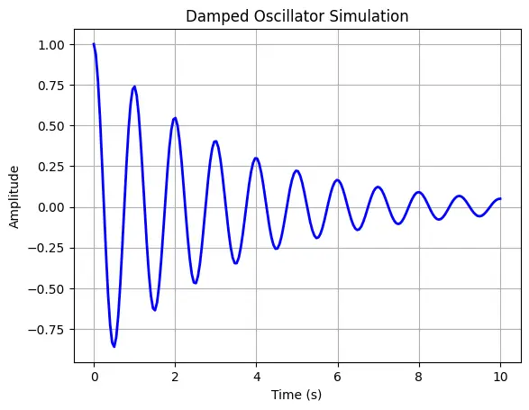
2. Scientific Simulations and Modeling
Researchers often require quick visualization of simulation results. PyLab can be used to plot the evolution of physical systems over time, such as oscillatory behaviour in mechanical systems or wave propagation in physics.
Example: Damped Oscillator Simulation
from pylab import *

# Time array
t = linspace(0, 10, 200)

# Parameters for a damped oscillator
A = 1.0   # Initial amplitude
b = 0.3   # Damping factor
omega = 2 * pi  # Angular frequency

# Damped oscillation function
y = A * exp(-b * t) * cos(omega * t)

# Plot the damped oscillation
plot(t, y, 'b-', linewidth=2)
title('Damped Oscillator Simulation')
xlabel('Time (s)')
ylabel('Amplitude')
grid(True)
show()
3. Real-Time Data Monitoring
For applications such as sensor data acquisition or financial market analysis, real-time plotting is essential. PyLab’s interactive mode can be used in conjunction with live data streams to update visualizations on the fly.
Example: Real-Time Plotting (Simulated)
from pylab import *
import time

# Enable interactive mode
ion()

# Create a figure and axis
figure()
t_vals = []
y_vals = []

# Simulate real-time data acquisition
for i in range(100):
    t_vals.append(i)
    y_vals.append(sin(i * 0.1) + random.randn() * 0.1)

    # Clear current figure
    clf()

    # Plot the updated data
    plot(t_vals, y_vals, 'g-', marker='o')
    title('Real-Time Data Monitoring')
    xlabel('Time (s)')
    ylabel('Sensor Value')

    # Pause briefly to update the plot
    pause(0.1)

# Turn off interactive mode and display final plot
ioff()
show()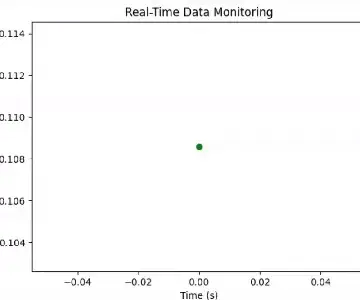
4. Educational Purposes and Rapid Prototyping
Educators and students benefit greatly from PyLab’s simplicity. Its MATLAB-like interface allows quick demonstration of concepts in mathematics, physics, and engineering without extensive boilerplate code. Additionally, researchers can use PyLab for rapid prototyping before transitioning to more complex production systems.
Why You Should Use PyLab
While modern Python programming often encourages explicit imports (e.g., importing only the required functions from NumPy or Matplotlib), there are compelling reasons to continue using PyLab in certain contexts:
1. Conciseness and Productivity
The single-namespace approach offered by PyLab allows for very concise code. This is particularly useful when the primary goal is rapid prototyping or interactive exploration of data. Instead of juggling multiple imports and namespaces, you can focus directly on the analysis at hand.
2. Ease of Transition from MATLAB
For scientists and engineers coming from a MATLAB background, PyLab offers a familiar environment. The functions and plotting commands mirror MATLAB’s syntax, thereby reducing the learning curve and facilitating a smoother transition to Python.
3. Interactive Data Exploration
In environments like IPython and Jupyter Notebooks, PyLab’s ability to quickly generate plots and update them interactively is invaluable. This interactivity fosters a more engaging analysis process, enabling you to experiment with parameters and immediately see the results.
4. Comprehensive Functionality
The combination of Matplotlib’s robust plotting capabilities and NumPy’s efficient numerical computations in a single module makes PyLab a versatile tool. Whether you’re visualizing statistical data, running simulations, or monitoring real-time sensor inputs, it provides the necessary tools without the overhead of managing multiple libraries.
5. Streamlined Learning Experience
For beginners, having a unified set of functions to learn can be less overwhelming compared to juggling multiple libraries with differing syntax and conventions. This can accelerate the learning process and encourage experimentation.
Conclusion
In conclusion, PyLab provides an accessible entry point for both newcomers and experienced practitioners seeking to utilize the power of Python for scientific computing and data visualization. By understanding its features, exploring its practical applications, and acknowledging its limitations, you can make informed decisions about when and how to incorporate PyLab into your data science workflow.
PyLab simplifies scientific computing and visualization in Python, providing a MATLAB-like experience with seamless integration with NumPy, SciPy, and Pandas. Its interactive plotting and intuitive syntax make it ideal for quick data exploration and prototyping.
However, it has some drawbacks. It imports functions into the global namespace, which can lead to conflicts and is largely deprecated in favour of explicit Matplotlib usage. It also lacks the flexibility of Matplotlib’s object-oriented approach and is not suited for large-scale applications.
While it is excellent for beginners and rapid analysis, transitioning to Matplotlib’s standard API is recommended for more advanced and scalable visualization needs.
Key Takeaways
- Understand the Fundamentals of PyLab: Learn what is it and how it integrates Matplotlib and NumPy into a single namespace for numerical computing and data visualization.
- Explore the Key Features of PyLab: Identify and utilize its core functionalities, such as its unified namespace, interactive environment, MATLAB-like syntax, and comprehensive plotting options.
- Apply PyLab for Data Visualization and Scientific Computing: Develop hands-on experience by creating different types of visualizations, such as line plots, scatter plots, histograms, and real-time data monitoring graphs.
- Evaluate the Benefits and Limitations of Using PyLab: Analyze the advantages, such as ease of use and rapid prototyping, while also recognizing its drawbacks, including namespace conflicts and limited scalability for large applications.
- Compare PyLab with Alternative Approaches: Understand the differences between PyLab and explicit Matplotlib/Numpy imports, and explore when to use versus alternative libraries like Seaborn or Plotly for data visualization.
The media shown in this article is not owned by Analytics Vidhya and is used at the Author’s discretion.
Frequently Asked Questions
Q1. What exactly is PyLab?
Ans. PyLab is a module within the Matplotlib library that combines plotting functions and numerical operations by importing both Matplotlib and NumPy into a single namespace. It provides a MATLAB-like interface, which simplifies plotting and numerical computation in Python.
Q2. Is PyLab still recommended for production code?
Ans. While PyLab is excellent for interactive work and rapid prototyping, many experts recommend using explicit imports (e.g., import numpy as np and import matplotlib.pyplot as plt) for production code. This practice helps avoid namespace collisions and makes the code more readable and maintainable.
Q3. How does PyLab differ from Matplotlib?
Ans. Matplotlib is a comprehensive library for creating static, interactive, and animated visualizations in Python. PyLab is essentially a convenience module within Matplotlib that combines its functionality with NumPy’s numerical capabilities into a single namespace, providing a more streamlined (and MATLAB-like) interface.
Q4. Can I use PyLab in Jupyter Notebooks?
Ans. Absolutely! PyLab is particularly effective in interactive environments such as IPython and Jupyter Notebooks. Its ability to update plots in real-time makes it a great tool for exploratory data analysis and educational demonstrations.
Q5. What are some alternatives to PyLab?
Ans. Alternatives include using explicit imports from NumPy and Matplotlib, or even higher-level libraries such as Seaborn for statistical data visualization and Plotly for interactive web-based plots. These alternatives offer more control over the code and can be better suited for complex or large-scale projects.
Hi there! I am Kabyik Kayal, a 20 year old guy from Kolkata. I'm passionate about Data Science, Web Development, and exploring new ideas. My journey has taken me through 3 different schools in West Bengal and currently at IIT Madras, where I developed a strong foundation in Problem-Solving, Data Science and Computer Science and continuously improving. I'm also fascinated by Photography, Gaming, Music, Astronomy and learning different languages. I'm always eager to learn and grow, and I'm excited to share a bit of my world with you here. Feel free to explore! And if you are having problem with your data related tasks, don't hesitate to connect


